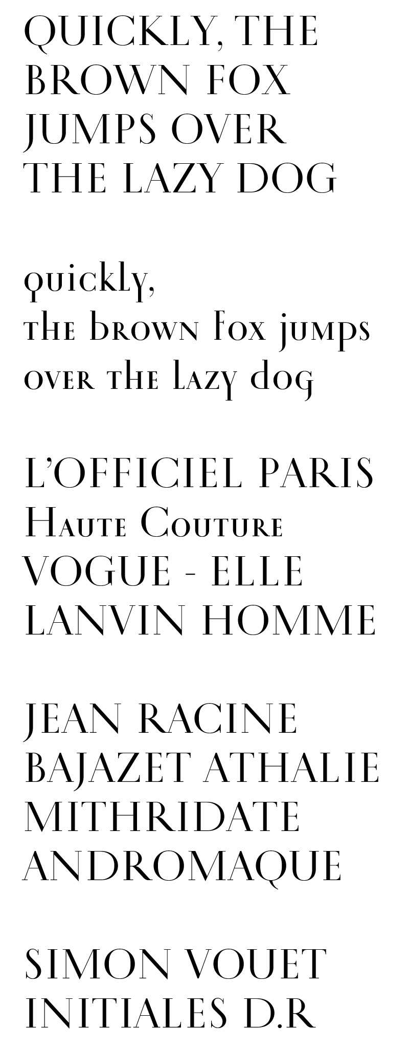
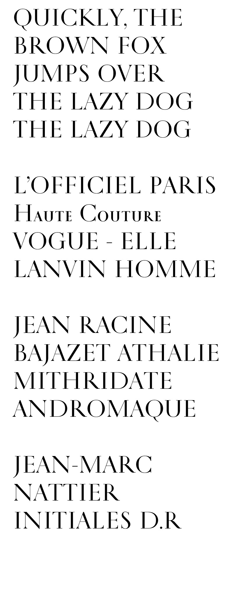
Good Morning!
Here is a barmy project of mine. I have undertaken it to research the compatibility (or lack thereof) of two styles of fonts I really like. So basically, I worked on drawing Didot upper-case letters with the rhythm of the Trajan font. I have made things more complex by adding a lower-case which works on the idea of the Trajan. Don't look too much at the figures, they have not really been worked on properly.
I look forward to hearing your reaction and comments (so far, type-creators hate it and graphic designers are intrigued by it, because I made bold and non-fashionable choices, some of which I almost regret).
| Attachment | Size |
|---|---|
| 20081213-TESTTDP081212bis[1].pdf | 26.94 KB |