Hey everyone.
Well, I just finished my first term at Art Center on Friday. Man, it was pretty grueling, they work the crap out of you.
I took Type 1 from Leah Hoffmitz who is an excellent type and logo designer. She does a lot of freelance work for Landor in San Francisco, and she drew both the FedEx and Banana Republic logo.
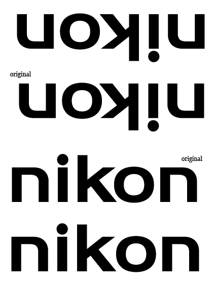
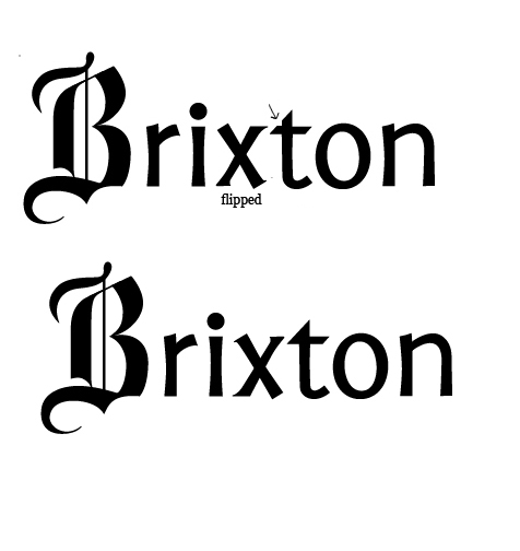
Anyway, we spent a good 4 or 5 weeks working on 2 logotypes; 1 corporate, 1 retail (or just smaller company). Just to let you know, these were not originally done on the computer by manipulating a typeface, they were both sketched and painted on tabloid paper in Plaka before more revisions, and then digitization. My corporate logo is for Nikon (camera company), the second is for a hat and clothing company called Brixton.
I've had about 4 weeks of feedback from my teacher, so I was just curious to hear what some of you guys had to say about the logotypes. Thanks!
Josh
| Attachment | Size |
|---|---|
| Nikon.jpg | 369.31 KB |
| Brixton.jpg | 378.4 KB |