
Does anyone recognize the geometric display typeface used on this packaging? Both for the heading, and "GRAVITY". Looks like a lighter weight of Machine. Thanks in advance.
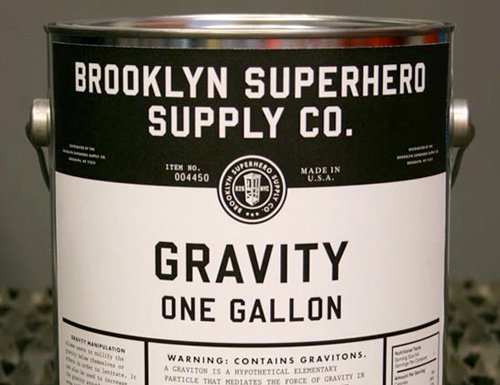
Does anyone recognize the geometric display typeface used on this packaging? Both for the heading, and "GRAVITY". Looks like a lighter weight of Machine. Thanks in advance.

I'm betting on United from House Industries, although the sample I saw online showed an "I" with crossbars.

Yep. United Sans Semi Condensed Heavy. There’s a serifless, alternate ‘I’, too.
Thanks. I'm pretty sure this was done before United came out, but I could be wrong.
It's not United. The counters in the "R" and "G" aren't angled like United.
Captured from web.archive.org on 24 Aug 2014. view this capture