
At first glance this has some similarities to Trajan but it's clearly not that. Can anyone help me find out what it is? Thanks.

At first glance this has some similarities to Trajan but it's clearly not that. Can anyone help me find out what it is? Thanks.

That is a really crap alteration of Trajan by an amateur, It is SO bad.
Nick Cooke
The reason I think it's a font in its own right is that the W and U are so different, and so are the serifs, so I don't think it's Trajan that's been altered.
I'm pretty sure I've seen this font or something similar a long while ago, but I can't remember the font's name - my memory is so bad these days...

Although it is not Albertus it is an eerily similar light version of Wolpe's work from the 30's with a bit more thick/thin variation. I believe the O is implanted and this could be a bad redrawing of his work. Note the structure of the W and the leg of the R. The weights are all over the place so it could have possibly been drawn/painted by a drunk signpainter : )
.Michael
I don't think so. It must have been done for Norwich Playhouse. It's so uneven, who'd want to pay good money for it?
Get in touch with NP and ask them who did it.
Nick Cooke
"It’s so uneven, who’d want to pay good money for it?"
People with no taste! And who said they paid : )
Michael
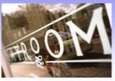
Went to the site and the logo there is not reflective of the one above. Completely different. I think the above is maybe from a sign or something custom done. Oddly enough, as I went through the site guess what type appeared... are you ready... ALBERTUS! Those stem to "serif" transitions are pretty hard to mistake!
Michael
Edit: Never mind... it was snide.
Michael
"The weights are all over the place so it could have possibly been drawn/painted by a drunk signpainter : )"
That gave me a chuckle! The logo as I've been given it, which is the image in my first post, (even though I asked for a high resolution image!) looks like it's a photo of a bad photocopy of a scan, which might explain some distorting effects. Certainly the U has bleached out a lot, becuase looking at the sign on the Playhouse building the counter of the U joins up to the spur; there isn't a gap as in the image above.
Thanks to all for your helpful posts. I still haven't found the font.

My guess is Weiss Std - one of Adobe Font Folio collection:
http://store1.adobe.com/cfusion/store/html/index.cfm?store=OLS-US&event=...
Only that the image might be suffering from some retouch.
:D
--- pinky kinky winky ---
Mark
When I saw the Albertus on the windows I figured they brought in someone to do some additional work and they probably said "can you emulate this?" But as I said if you look at the stem to serif transitions you can definitely see the relation. When I first looked at your attachment the Albertus alarm went off because some of the critical characters are direct draws with perhaps a little bit of inexperience with thick and thin thrown in. The upper left join of the N is different and the terminals of the E, C and S don't match but that is why I said he/she was inexperienced. If you look at the playroom piece you can see the same small O that is monoline and the "serif" structure I am talking about.
But then it could just be an ugly free font : )
Michael

No, the logo on the window is surely based on Albertus (but it's for "Playroom").
The main "Playhouse" logo is surely handlettered, no matter bad or good.
They should give you the logo, otherwise they do not care in the first place, it seems…
Captured from web.archive.org on 13 Nov 2014. view this capture