
I need to know what font face this is, if it exists in a digital format:
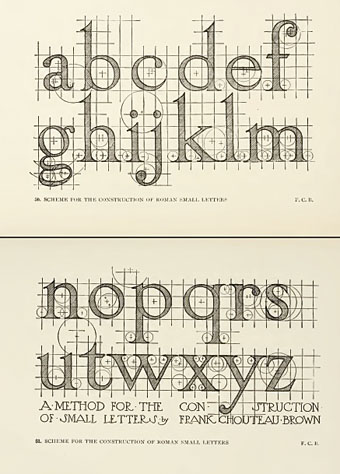
Or anything similar.
I need to know what font face this is, if it exists in a digital format:
Or anything similar.

It’s not technically a font, it’s from a book called “Letters and Lettering” written in 1902... about 80 years before fonts were invented.
There might be a font that’s similar in style, but it won’t be an exact match. These characters are pretty unique looking. Perhaps someone knows a face that could be close.
Initially I thought of Benguiat. http://www.myfonts.com/fonts/itc/benguiat/familytree.html
I’ve done some researching and it turns out it has characteristics of most serif fonts, but there are a few things that are different about it that I like. The long hooks and curves in particular.
Aha it seems someone has replied, I’ll check that font out thanks.
Wow- benguiat looks very little like that face. Hopefully someone else can come up with something better (thanks for the timely and well meaning response though!)

Tristis, are you looking for a font with all the circles, or one that looks like the main skeleton.
incidentally, re: digital type ... this is from a Paul Shaw / AIGA piece:
1968 (first digital typeface)
Digi-Grotesk S Despite its derivative appearance—it looks like a condensed knock-off of Neuzeit Book from Stempel—Digi-Grotesk S is significant because it was the first digital typeface. It was created by the staff of Dr. Ing. Rudolf Hell, the company that pioneered cathode ray phototypesetters.
1975 (first original ikarus face)
Marconi Designed by Hermann Zapf for Hell, Marconi was the first original typeface to be produced with the Ikarus computer-aided design and digitization system. Ikarus, developed in 1973 by Peter Karow of URW (Unternehmensberatung Rubow Weber), was the dominant type design and production tool well into the 1990s.
kinda quirky text with some sharpness:
http://www.myfonts.com/fonts/letraset/edwardian-medium/
you might also try the red rooster collection maybe/?
The circles are for spacing and what-not. I doubt I’m going to find a typeface with all the exact quirks of the one pictured- I wonder how much it would cost me to have that traced and turned into a font? Surely there are no copyright limitations.
Frank Chouteau Brown was an American architect. I’m currently downloading his Letters and Lettering, from Project Gutenberg. I will notify you if I find something relevant. :)
Edit:
By the way, I think this will be a very interesting piece to digitize. Also, the copyright of his book ’Letters and Lettering’ has long since been expired. If it can be found in Project Gutenberg, then its copyright is expired.
You can get a copy of the book here.
Yes I actually glanced at the page this was referring to, I believe it was his own sketch of roman small letters, and when you compare it to Times it actually has a few similar features. I also think he does the capital letters in there as well.
I also think this would be an excellent serif font- So if anybody is interested I’d love to see where this could go. I’m personally not skilled enough with the pen tool to fathom doing something so delicate.
Captured from web.archive.org on 11 Dec 2008. view this capture