
I was surprised to see Process Type Foundry's Locator Display on this box of Lucky Charms. I'm not sure whether it works or not, but I am sure I never would have thought of using it in this situation.
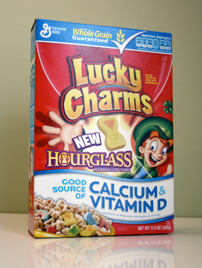
I was surprised to see Process Type Foundry's Locator Display on this box of Lucky Charms. I'm not sure whether it works or not, but I am sure I never would have thought of using it in this situation.

>I was surprised to see Process Type Foundry’s Locator Display on this box of Lucky Charms.
Both General Mills and Process are based in Minneapolis - might be a connection.

EEK! it looks so weird! In canada every package is bilingual english/french.
Y'know, our packages are cleaner than that too...
Something I noticed walking through American grocery stores is that, even thought they only had 1 language to deal with, they english-only packaging was WAY more crowded and busy than our Canadian bilingual packagine (and I'm also not a fan of american typography, much more 'novelty' than 'style' for my taste.
The only clean and legible packages in the US were multi-national copmanies, whose designers would have had to design multi-lingual packaging in other countries (canada, europe) like Kraft, Knorr and others like that.
I wonder, is our bilingual packaging in Canada busier and more loaded down than European Multi-lingual packaging? I know one of the impediments here are the 'equal representation laws' that require english and french to have (often times) equal point sizes, even though the french runs 20% longer on average.
It might be nice to have predominantly english or predominantly french packaging, with some bilingual elements.
Sorry about this whole thing, it's just so foreign *not* to see le french
"packagine" is to packaging what margarine is to butter?
haha, I can't believe it's not packaging!

>I was surprised to see Process Type Foundry’s Locator Display on this box of Lucky Charms.
Me too!
I think the same white calcium/vitamin banner is applied to many cereals so it tends to look a little plunked into place.
Captured from web.archive.org on 24 Aug 2014. view this capture