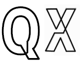
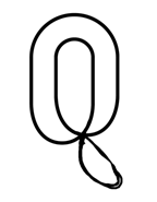
I've been working on a continuous line typeface with the geometry of a geometric sans. I like the flow of Morice produced by Letterbox, so I wonder if the glyphs I have constructed so far are too stiff. I'm not sure my characters follow a good standard of proportions. I wonder how difficult lowercase, numerals and special characters will be. I'm having a hard time envisioning how lowercase are going to work at this point (except for maybe a lowercase b and d - they
could be based off of the P). Thanks in advance for your feedback.
Here's a quick overview of my current concerns with each of the glyphs:
A - Is the crossbar too low?
B - Does the lower bowl protrude too little or too much?
C - This is one of the few glyphs without a overlap. Do you think that
breaks the system too much? I know that Cs, Os and other rounded glyphs
extend above the cap height and below the baseline a little, but I'm not
sure how far to extend them.
D - I'm not sure if the curves are constructed ideally.
E - This was the first glyph I constructed on the computer. I'm not sure
if the crossbar extends too far or too little.
F - Same concern with the F as the E. Should the F be based off of the
E?
G - I wonder if the top of the G is too flat. Should the G relate more
to the C? Or should the C relate more to the G?
H - Is the height of the crossbar too centered?
I - Should the I have an overlap?
J - Does the J get too flat and geometric at the bottom?
K - The join around the crossbar seems kind of stiff
L - Should there be more contrast between the vertical and horizontal
strokes
M - The M gets kind of messy and challenging. I wonder if a sideways E
would be a good place to start?
N - Should I figure out the N before the M?
O - I wonder if I need some sort of overlap.
P - This is probably my favorite glyph. The P was the initial glyph that
I sketched. I wonder if the transition between the horizontal lines and
the curves are too abrupt.
Q - This character just doesn't quite sit well with me. I would prefer
it be constructed as one continuous line.
R - Not sure I placed the right leg in the right spot.
T - I kind of just guessed on the width of the T.
U - I prefer to have an overlap of some sort. I wonder if the transition
between the vertical lines and the curves are too abrupt.
V - I am kind of bothered by the open bottom portion of the V.
W - Two Vs don't seem to create a very good W. I'm not sure where to
place the intersection.
X - I haven't tried an X yet
Y - The Y isn't a perfect continuous line. I feel the same way about the
Y that I do about the Q. There must be a better solution.
Z - The Z doesn't really fit with the other glyphs. I'd like to explore some more options.
| Attachment | Size |
|---|---|
| TYcontinuousline.pdf | 417.75 KB |
| TYcontinuousline2.pdf | 15 KB |