Typophile

Daphne - FREE Download

Arlo Vance

Daphne, the result of my BFA project is being released free under a similar license that Jos Buivenga/exljbris uses.

Download Daphne

I'd love to get any response/comments, images of it in use, etc.

I'm working on an italic right now (doing the roman only far exceeded the requirements of the project and my time limits)
Eventually, I'm hoping to release a couple more weights: bold and light.
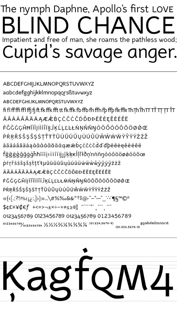
Nice work, Arlo. The care and hours that went into this are evident. Glad you included the alt characters -- they'll certainly make the font more usable. I'm particularly fond of the alt k. Keep us posted on the progress of the italic and other weights.

Thnk you, it's very generous on your side…
It has some very interesting solutions, although some lowercase may be distracting in a full-lenghth text.

Be careful: the UC-LC and UC-UC ligatures remain at capital-height when you activate "Caps to Small Caps", because you placed the [dlig] feature before the [c2sc]. You should either revise the features' order or design small caps ligatures. The problems seems solvable by just swapping these two features' order.

EDIT: [smcp] needs also to be above [dlig] to avoid this problem.

It is truly a fun, deserves to be generated from a full family...

[qassim haider]
sense of calligraphy
www.qalligraphy.net/fla/

It's a great effort Arlo. I recommend you keep the design in development and add refinements based on print reading tests. Claudio is ryte about the distracting lower case forms.

j a m e s

The modulation of the stems reminds me of Primetype’s PTL Manual Semi:

http://www.primetype.com/faces_info.php?fid=14

@James: It all depends on how you use it. For its homogeneity I keep saying it has distracting elements. The irregularity need to have consistence, that's what I mean.

@Claudio
Thanks for the tip on the features' order.

@James & Claudio
I realize Daphne is bursting with personality. Any further details on where you're getting caught up with the lowercase? I've been staring at it far too long.

Hi Arlo. I think the most distracting element comes from the ascenders of letters like [b] [h] and [k] leaning forward. The rest may just be my own taste, taste gets too much in the way and prevents appropriate judging.

Captured from web.archive.org on 13 Oct 2013. view this capture