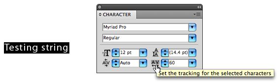
I have recently really started to doubt my own typographic eye after certain critique from a older designer about kerning. And since there are never hard and fast rules about kerning, i thought a discussion will put my mind at ease!
I just came out of the new Bond movie. And it is not my intention to sound like a smart ass, but i would like to bring two examples to the table for discussion.
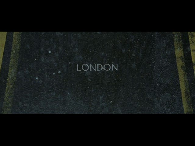
First, Did they kern the O so close to the D on purpose? Leaving a a large gap between the O and the N?
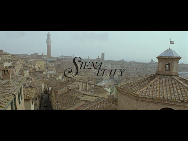
Second, In my opinion space between the E and N is too wide compared to N and A. And "ITALY" seems to be really loose compared to "SIENA".
I just wanted to know what other people think, so I know if its the type, or if its just me...
p.s. Apart from squinting... do any of the more experienced typographers in this forum have techniques they use? In particular, I find myself 'lost in the type' after kerning it for a while, and i am unable identify the problematic spacing as easily.
Thanks!
Eric.