Typophile

Check this face out!?

Jessieb7

What do you all think of this face being used as the font for a type heavy, tire ad campaign that's trying to sell to women? I'm recommending that the client use a more grotesk or geometric sans with a serif if they want an secondary typeface. Any comments on this Caramella font?
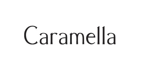
I agree with your though train. I am not sure about these being a leading type face. pretty face but kind of airy.

Oh and one more thing, there are no other weights or styles. This is it. Just Regular! So I'm thinking for an all type ad I should have more options for weights?

Anyone know of a good partner font for this one?

I think you're on the right track - geometric sans makes more sense. Something like this is more cosmetics/fashion. I wouldn't use this if I had the choice. It looks like a students work. No offense.

Captured from web.archive.org on 24 Aug 2013. view this capture