Typophile

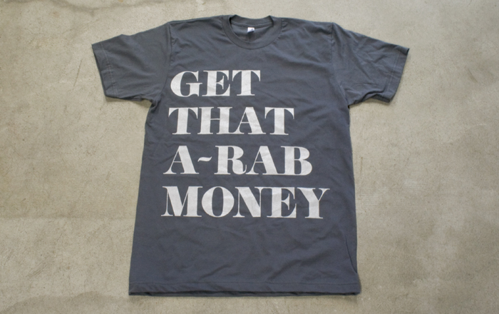
So... I think I did a good job typesetting this... but...

cotdamn

Let me know your thoughts...

I have always considered myself a decent typographer, but have never really had my stuff critiqued by people that know what they are talking about... just coworkers, etc. So, in my mind I did a good job on this... but I would like to know what you guys see as places that improvements could be made.

Thanks in advance.
this board is absolutely beautiful, btw.

dude.

did you just post that on b3s recently? or am i having a stroke

yes... and no you're good... no stroke.

amazing.

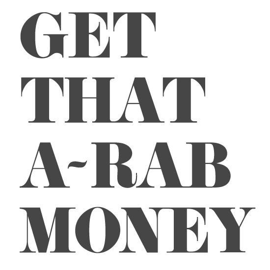
i personally would tighten up the GE and probably the MO and the ON but that's just me

I would probably have decreased the leading a bit. :)

I personally would have tightened it up across the board. I think that the "That" is pretty damn perfect. I woulda stuck with that spacing throughout. Great outcome and shirt design however. Keep it up.

Captured from web.archive.org on 24 Aug 2013. view this capture