
Hey all,
I'm a design student taking my first serious stab at type design.
This is hard work and I'm getting a little overwrought. I thought I'd take
a break and post what I've got so far on the "chopping block" as it were.
I know there are big issues with the face so far, but, let's talk about
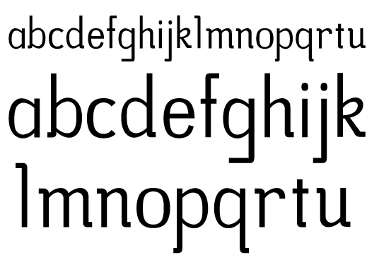
'em and how I can improve the set. I have only developed what you see
here so far. I am trying for a humanist face LOOSELY rooted in Gill Sans.
The principle design elements are the curved slab serifs and the stroke
taper at the connections.
Say what you will; let's get these letters into shape!
Thanks,
Rachel


