
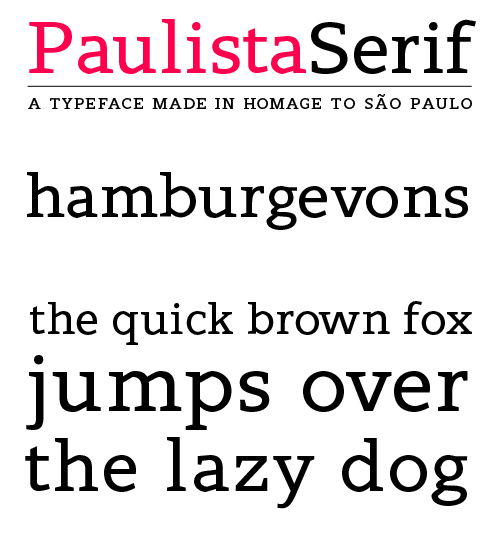
This is a typeface I've been working on for quite a while.
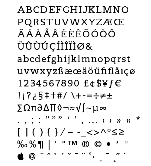
Some uppercase characters and numbers still need some adjustments, but I would love to her some critique for now.
Alex Heilmair
This is a typeface I've been working on for quite a while.
Some uppercase characters and numbers still need some adjustments, but I would love to her some critique for now.
Alex Heilmair

Not bad, Alex! It's probably just your image, but the stem widths appear uneven ('b' too light). Try a "save for web" from Illustrator instead. The 'g' is a little too heavy at the bottom of the link between bowls.

That looks quite nice. A few things:
I saw the differences in weight too. But looking at the PDF, I think it was probably the jpeg that did that.
I also think the overshoot on round characters might be too large. The baseline seems uneven.
Places where strokes join the stem (like on the bottom of the 'a' and 'b' etc.) could use a bit more room, to counter the appearance of little black blobs.

The signature shape here is obviously how the round bowls switch to straight strokes. It's jarring to my eye now, but mostly because unless I look carefully it just comes off as a malformed curve. You may want to consider actually increasing the abruptness of that break (thinning the straight parts? increasing the acuteness of the angle of break?) to make it more assertive, so that the reader's eye gives up on interpreting it as a single rounded stroke. Just an idea...
Thank you all for your comments.
I had some busy days and haven't had much time to work on the font.
Soon I'll update you with some changes.
The lowercase t looks like it's floating when paired with a non-overshooting glyph. Try to overshoot it, but not too much. Also, your both uc and lc s look like they're from another font. Maybe you should add the 'stiffness' that other glyphs have (look at the counter of b, for example).
Best of luck. It looks really nice :)
Captured from web.archive.org on 23 Jul 2014. view this capture