Hello,
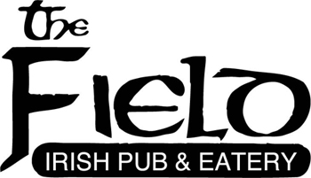
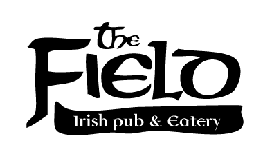
Just wanted to get some feedback on this. It is an identity redesign for an Irish pub I work at called 'The Field'. The pub resembles an Irish farmhouse or cottage and is very rustic and homely - extremely unique and traditional. They have been in business for over 7 years and have quite a poor and hacked up Celtic blackletter logotype at the moment. They are renowned for great food and music.
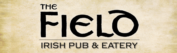
The type is set in a modified version of Device's Sparrowhawk which was traced and scanned to give it a handlettered feel. The tagline is set in Steelplate Gothic Shaded. The parchment is quite likely to be the treatment so I thought it should be in there.
Thanks,
Jay
NEW LOGO:
OLD LOGO: