Hey typophiles,
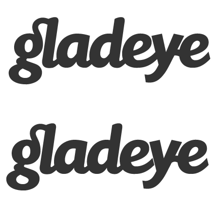
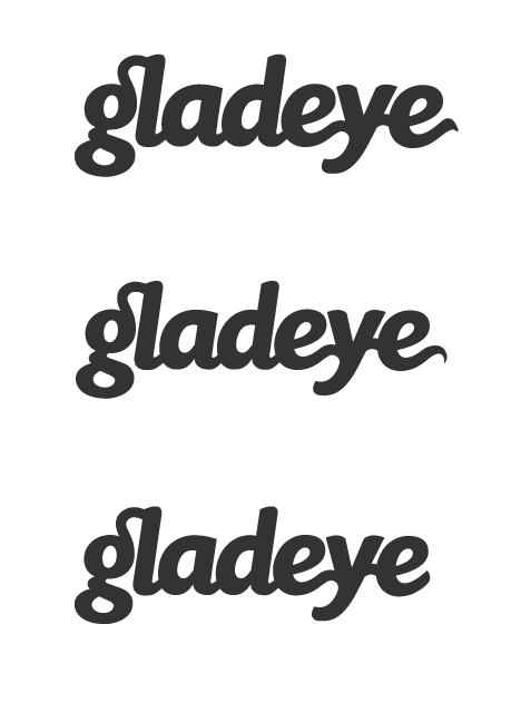
I've been working on a new logo for our company on and off for ages and feel I'd benefit from an impartial critique of the current favourite. I'm not too sure about the kerning and the alterations I have made to the letters and would like to hear what you think.
A little background about our company and who the target 'market' would be. We are an interactive agency specialising in high-end flash websites and online production. Our current clients are mostly television/film production companies, photographers and various advertising agencies.
The aesthetic I was going for with the logo is modern and clean while retaining a sense of playfulness. I also want the logo to feel a little retro without being too derivative..
Any comments greatly appreciated, this is not really my forte and has been a lot harder than I imagined!
p.s. The bird is a 'Gladeye' and would be used both in conjunction with the name and on its own.