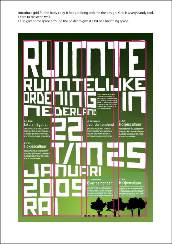
Well not burn, but I'd like some critique since my teacher seems to have a hard time giving some constructive argumentation. Isn't that what a teacher is supposed to do?
Anyways...
The assignment was to design a foldable poster for a fictional congress. The congress is about the expansion of urban areas and the problems of over-population in some areas. This is all taking place in the Netherlands, which is pretty crowded.
Naturally the text is in Dutch so I'll give a quick translation might that be of importance. I was hoping the image would speak for itself.
SPACE
SPATIAL DESIGN(?)IN THE NETHERLANDS
22-25 JANUARI 2009
RAI(congress centre in Amsterdam)
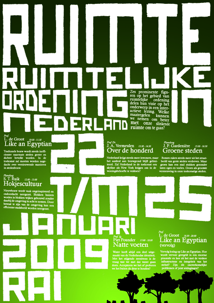
I've made the type myself and played with it a bit. The edges are supossed to be a bit ragged and so is the smaller text.