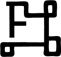
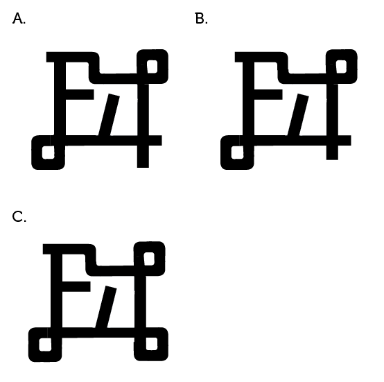
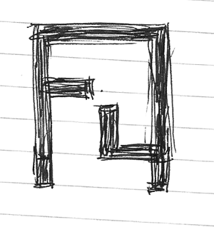
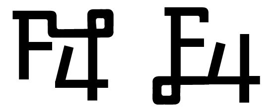
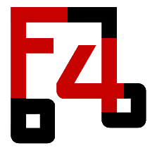
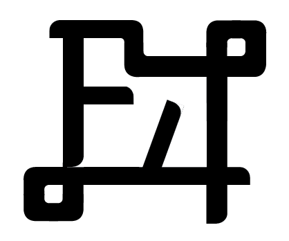
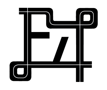
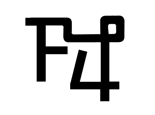
Hey friends! I'm doing a little work for a local 'zine' thats going to review the local music scene, it's called F4 and I'm designing the logo. Here I have a couple examples, I'm using MUSEO and I want to ask you guys about some legibility. I was concerned that the '4' form would not be recognizable in sketch (a) so I broke the stroke of the 4 at the top in sketch (b). How do you feel about the legibility of sketch a and the odd broken 4 of sketch b?
please excuse the rough edges of these sketches.
a:

b:

Thanks!
-Scott Sullivan
www.trifepdgm.com