hey everyone
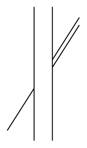
was just working on my dissertation and im doing a type analysis of helvetica and univers and i worked my way through various letter to x where i found some strange going ons i wanted to see how the stroked lined up cause univers looked offset, so i dropped them into illustrator, expanded them, chopped them and extended the lines and this is what i found:
http://i49.photobucket.com/albums/f291/crazyreaper/Helvetica-to-Univer-C...
nothing lines up, helvetica does a lot more than univers, most of the lines in univers aren't even parallel, anyone else find this otherwise the last 2 thousand words are useless cause i might be using dud versions
Matt