Hi fellow typites,
could I get some advice on this brochure design please?
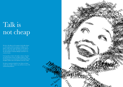
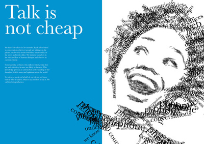
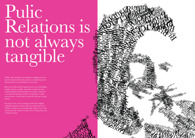
The brochure is called a thousand words. The idea is that it stresses the importance of words, following from the saying that a picture is worth a thousand words. The opening spread says 'some words are worth a thousand pictures'. We have chosen an illustrative style made up of text which I am quite happy with. I am just still wandering how to treat the type on the opposite page. At the moment it is just white out and quite structured which is in contrast to the more chaotic illustration style. Does it need more creativity? is it too clean? does the colour take the emphasis from the illustrations?
any feedback much appreciated!

| Attachment | Size |
|---|---|
| thousand words25.jpg | 135.09 KB |