
This is a logo to a chorus of a baptist church.
Ricardo Petrowski Chorus, First Baptist Church of Bairro das Graças, Rio de Janeiro, Brazil.
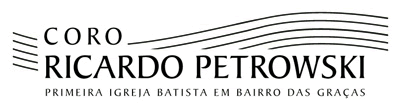
This is a logo to a chorus of a baptist church.
Ricardo Petrowski Chorus, First Baptist Church of Bairro das Graças, Rio de Janeiro, Brazil.
I’m guessing your trying to go for a musical staff in the background? What’s the concept?
courtney

Try taking the the staff shape from the top right, and moving it down to the left, then flipping it and moving it to the right to create wings. Just a thought.
- Lex
Yes, a musical staff.
The concept
This is the most traditional chorus of this church.
Traditional but contemporary.
I have used the chorus name into the musical staff, because the chorus is the music, the musical notes.
What about taking a nod from something a bit historically fancier?
utt73-
those are beautiful. I’m not sure of your level rose, but this might be a pretty good idea for a direction. I think the design you have is too static. Also, maybe try another typeface. I think you might want a lighter face, possibly script face?. it’s just that now, the lines of the “staff” and the lines of “CORO” are practically the same width. Think contrast in scale.
Also, just one small thought about the staff, it doesn’t read musical staff yet. Because it’s wavy...it reminds me more of water...or the more obvious...waves ;) Maybe add the end vertical bars at the end? (The thick and thin lines that are at the end of the sheet music.) Again..,just a thought, but ya know :D
courtney

I find that when I look at it, although I don’t get the feeling that it’s 100% done yet, I think it works.
The first thing that popped into my head is a sheet music book my sister used to have, Chopin and others I think.
You certainly communicated something with class, something musical and also something that’s current. Those are all what you seem to be going for, just finish up the details and I think you’ll be golden!
EDIT: ah, and I got that it was a staff because of the number (5) of lines, I’m not sure you need more than that, but I do find the ends of the lines too abrupt. a tapering of the lines at the end might soften them and make them feel more calligraphic. Just my 2¢
Captured from web.archive.org on 8 Nov 2008. view this capture