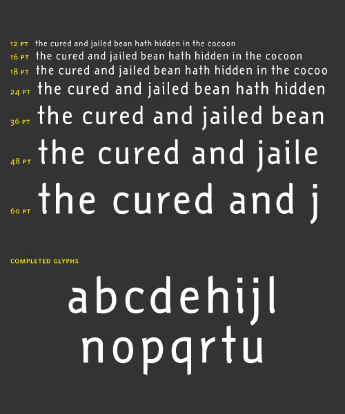
I've been working recently with FontLab Studio 5 and this is what I've got, so far:
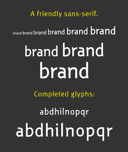
I'm still very unsure about my skills (especially with the beziers) but hopefully I can finish this typeface. I have absolutely no background in graphic design nor type, except possibly for the influences I have acquired by reading stuff in the web. Books and other materials regarding typography are very sparse in my region, although I've acquired Bringhurst's Elements of Typographic Style (3.0) and Hochuli's Detail in Typography.
I really want to finish this typeface, and I was aiming for a friendly yet clean sans-serif. It does look friendly to me, so far, but I'm not quite sure. Any comments, tips, or suggestions would be greatly appreciated. Thanks. :)
Edit: New pdf attached.
| Attachment | Size |
|---|---|
| Untitled Sans 0.011.pdf | 6.96 KB |
| Untitled Sans 0.015.pdf | 5.21 KB |