
Hi everyone,
This is an idea for one side of a flyer I'm working on.
I'm not happy about the three lines of text starting with 'To celebrate 5..'
Could anyone give any advice about how to set that better?
many thanks
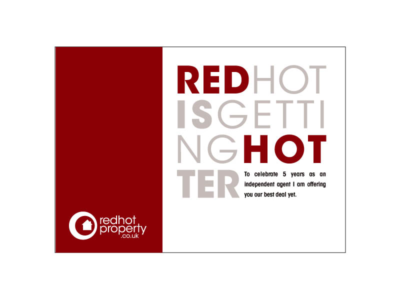
Hi everyone,
This is an idea for one side of a flyer I'm working on.
I'm not happy about the three lines of text starting with 'To celebrate 5..'
Could anyone give any advice about how to set that better?
many thanks

Those three lines of black text in the bottom right needs to be left aligned or at lest spaced better. I got your concept, but I'm bugged by the lack of space between REDHOTISGETTINGHOTTER. Have you considered something like "Hot, hotter, red"?

I'd like to see it at:
REDHOT
ISGETTING
HOTTER
With 'ISGETTING' scalled to fit the width of the layout.

The black colour seems very harsh next to the other ones. - Have you considered using a wider typeface to fill the space better?

If nothing else, spelling out "five" could help even up the wordspacing...
Captured from commoncrawl.org on 21 Apr 2015. original URL