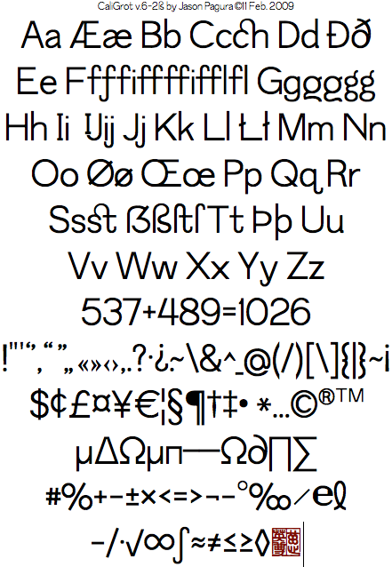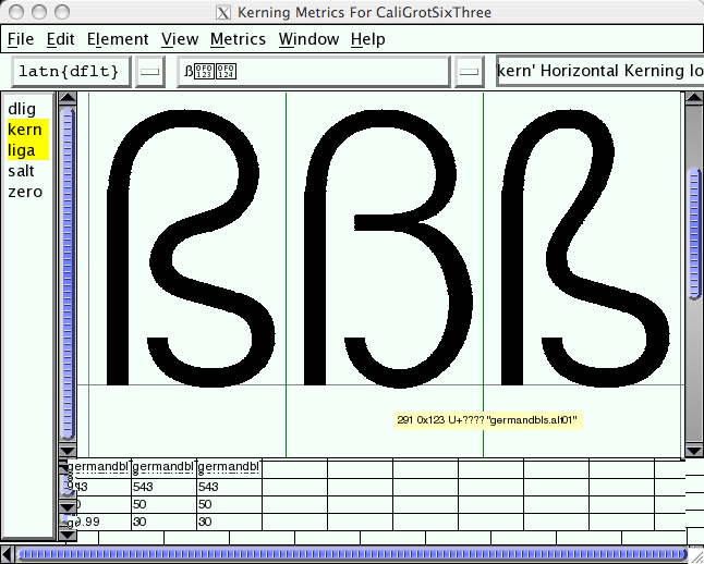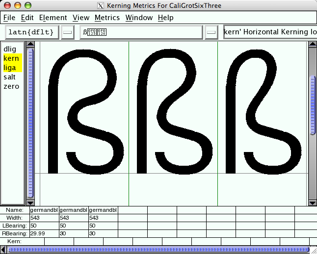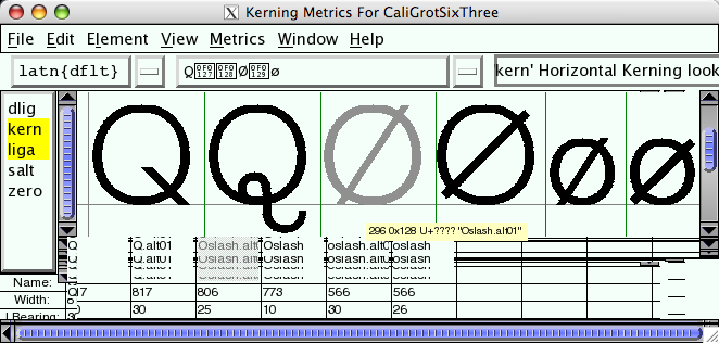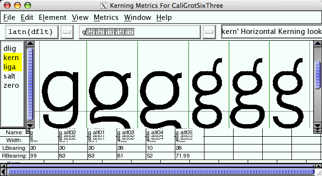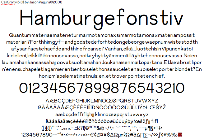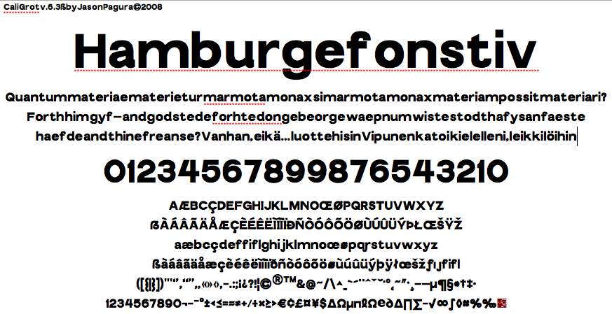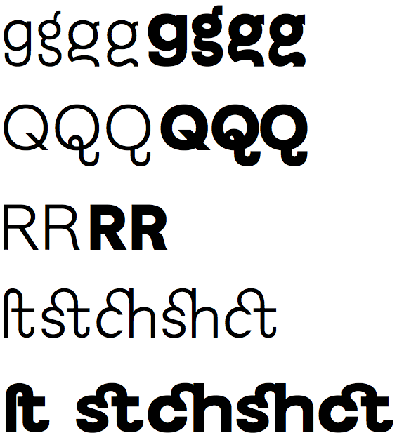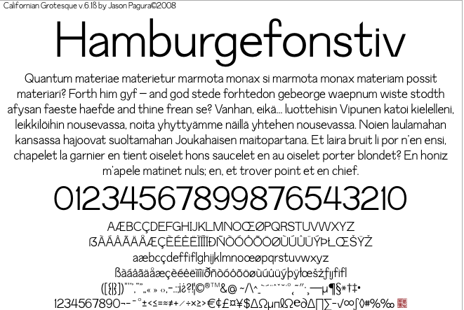
This is much an exercise in making something very controlled and unexpressive as it is in making a useful and attractive sans font in a limited time (a week and a half in this case). I think I still managed to shove a few quirks in there anyway. It's wound up a strange hybrid of Helvetica and Futura to my eyes, created entirely independently of course; all my own points and curves with the help of the Quaker space program. Perhaps it's too simply done. It still has some spacing and kerning issues but I'll iron those out before too long. Feedback, as always, is welcome and desired.
PDF contains the the basis of image above for full resolution viewing.
| Attachment | Size |
|---|---|
| CalGrot6-1sample.pdf | 22.03 KB |
| CalGrot6-2sampleB.pdf | 23.75 KB |
| CalGrot6-3sample.pdf | 23.28 KB |
| CalGrot6-3-XB2sample.pdf | 22.83 KB |