
I recently discovered this logo on lifelounge.com.au and was really impressed. Do you think this logo started out as Pistilli Roman? The W seems to look like Pistilli but in italic.
What do you guys think?
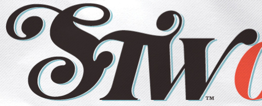
I recently discovered this logo on lifelounge.com.au and was really impressed. Do you think this logo started out as Pistilli Roman? The W seems to look like Pistilli but in italic.
What do you guys think?

Cabernet with stunted 'W' arm.
Wow, that is it.
Thanks Stephen

No.
Not contrasty enough.
Really, James? It's possible that the logo creator went back to the original film type source, but the outlines in the Cabernet digitization seem to match precisely, if not just a tad thinner (easily altered with a stroke).


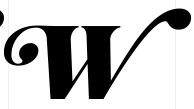
Definitly Jukebox Cabernet Italic Swash by Jason Walcott
edit: too late... Need to refresh my browser before posting...

Only slightly off topic, what kind of a world are we living in when we can't access a decent digital version of Pistilli Roman?
Should I launch a letter-writing campaign? Push for a voter referendum? Maybe Barack Obama can address this travesty when he takes office.

Didoni not good enough?
Didoni and Sahara are both appealing, but the contrast between thick and thin isn't right -- the super-thin strokes is what made Pistilli Roman so cool, IMO, and what made it look great at big sizes.
I'll keep hoping that someone will digitize it someday -- I know people would buy it.
If you want super contrast Freight Big goes pretty far.

Cyrus Highsmith did a digitization of Pistilli for Roger Black and Ricardo Feriche for a redesign of Playboy in Spain some years back. Not sure if they have any plans to release it ever. There may be rights issues.
-- K.
Stephen: I appreciate the suggestion of Freight -- it's nice, but no Pistilli Roman. It's like substituting Meg Ryan for Julie Christie (ha)
Kentlew: Thanks for the information, maybe Cyrus will market his version of Pistilli someday. I'll start sending him bribes. ;-)
Kent,
I've did a digitization of Pistilli Roman for a redesign of Glamour magazine years ago when Henry Connell was the art director. I know Dave Farey has done a digitization of it as well. At the San Francisco TypeCon, Dave and I compared our versions, and damn if they didn't look like the same face! No plans of any release.
It is a really difficult design to space properly. Unless of course if you want to smash all the letters together like they did in the 70s.
James

I prefer Big Figgins.
Captured from commoncrawl.org on 19 Apr 2015. original URL