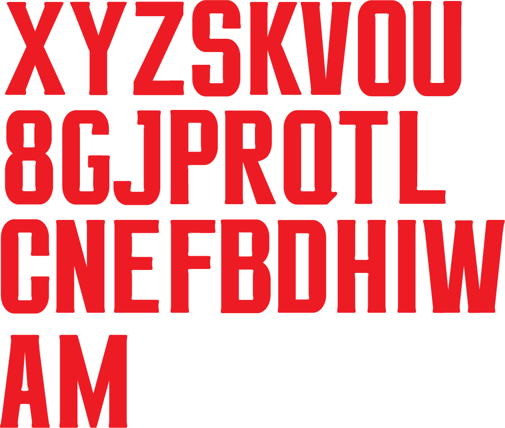
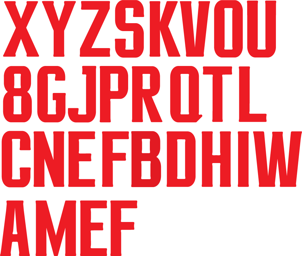
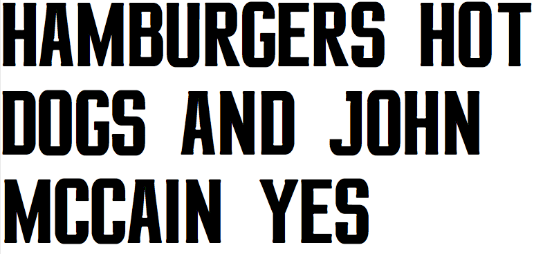
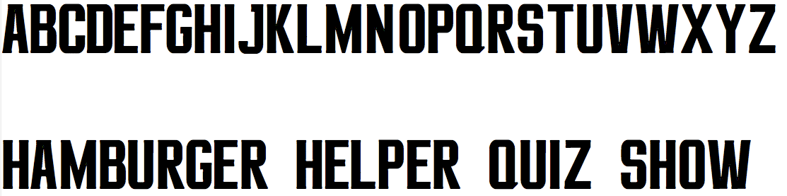
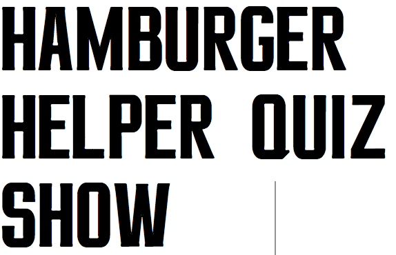
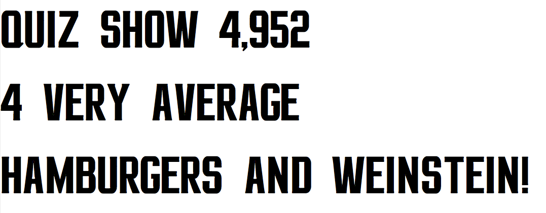
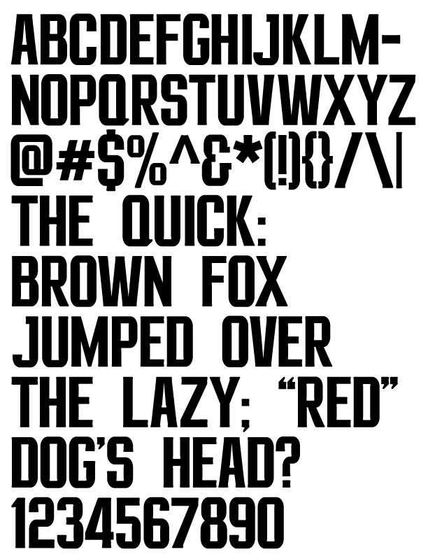
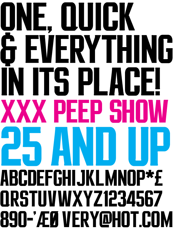
hey all. i've been working on this for awhile, would love to get some of your feedback on what i have so far. i still have to do lowercase, but the main idea of the uppercase is done. see any problems? this is my first typeface, so any help is greatly appreciated. i am currently working on tweaking each form.
thanks!