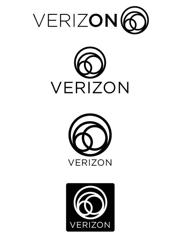
For school I was assigned to redesign the entire corporate identity for a company of my choice, starting with the logo. I chose Verizon because their current logo is thought to be one of the worst designed logos ever. I don't know if it's "the worst" but it certainly is pretty awful looking.
Key ideas that I'm trying to express are connection, broadcast, communication. The circles to me represent both communication, as well as a literal representation of broadcasting. An open network. An ever growing circle. These are all still in their early stages. The typeface I'm using is Gotham by Hoefler and Frere-Jones. Let me know what you think!
| Attachment | Size |
|---|---|
| verizon-typophlie-critique.jpg | 96.19 KB |