
Oops... I did it again.
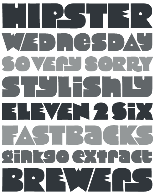
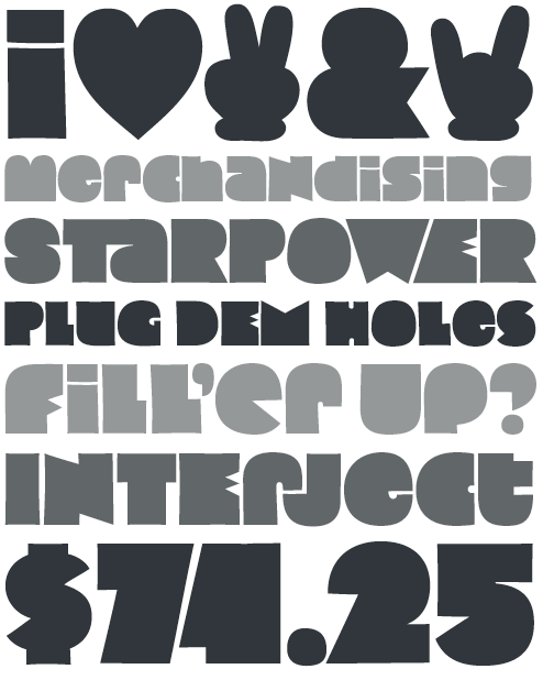
I've given my pop hit Cooter the star treatment. Give it up for Cooter Deuce.
Where the original Cooter offers a grab-bag of solid and counterpunched letterforms, Cooter Deuce has been split in two. The Regular style is endowed with a full set of counterpunched forms while the Plugged has its bowls and most of its counters filled or reduced for a heavier impression.
Compared to its predecessor, Cooter Deuce has been drawn with more consistently square proportions, and a handful of glyphs have been entirely redesigned. Taking advantage of the Opentype format, it has even been fleshed out with a bevy of alternate glyphs, dingbats, and nifty decorative ligatures.
If you've purchased the original Cooter at TypeTrust.com, there's a free upgrade available for download via the Order History pages of your TypeTrust Account. Some linework and kern pairs have been adjusted.
| Attachment | Size |
|---|---|
| CooterDeuce01.png | 42.57 KB |
| CooterDeuce02.png | 38.91 KB |

