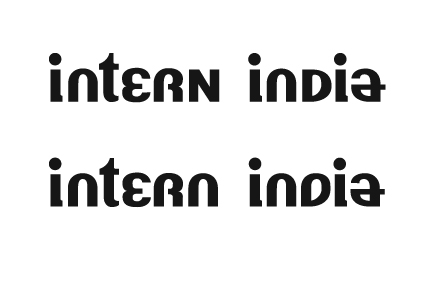
This is a current project of mine — I am trying to make a contemporary display face inspired by some hand painted signs that I saw in India. The typography takes bits from bold Hindi script which inspires some of the quirks of the roman letters. The other quirks come from how some Indian sign painters actually executed the roman letters. The goal of the type is to look ethnic without being ethnocentric.
I plan on using it as a logotype for a non profit. Right now I'm on the fence — is it quirky in a good way, or just plain ugly? Is it intriguing enough that I should continue with additional letterforms to create an uncial typeface?
Attached are two iterations of the proposed logotype, the top has a capitol n, and a relatively normal d (with a little quirk in the bowl.) The version on the bottom has an even quirkier D (which I prefer as it creates symmetry with the a, and continues the the rhythm of the rest of the the letterforms.)
This is in its infancy and line weights are not refined — Advice and criticism would be appreciated.