
I'm currently working on a slab serif based on my previous typeface Quicksand. I have two version at the moment, a rounded one which quite look like a typewriter font and the typical slab serif approach. As always, crits & suggestions appreciated.
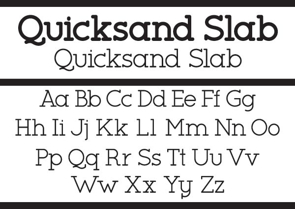
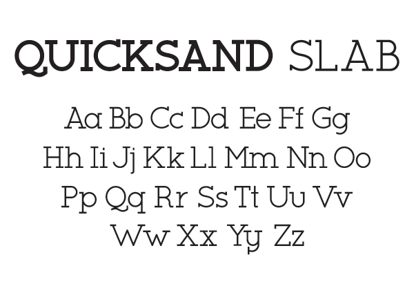
I'm currently working on a slab serif based on my previous typeface Quicksand. I have two version at the moment, a rounded one which quite look like a typewriter font and the typical slab serif approach. As always, crits & suggestions appreciated.

The hook on the j is a bit too short and abrupt for my tastes, but that's what they are. Very good looking and solid overall. It strongly resembles Lubalin Graph, as any geometric slab-serif is likely to, but I think you noticed that too and included features to differentiate this. Am I right?

Just an optical reference for your C, G, Q and O: http://www.typeworkshop.com/index.php?id1=type-basics&id2=&id3=&id4=&id5...

This is really neat. I prefer the roundy version.
To my eyes, the F, J and W are too wide, the y has too many serifs (compare to the g or u), and the serifs on the V need to be pulled in closer.
Hope that's helpful! :)

Maybe pull down the top end of the C, c, and G more, and/or shorten its serif?
Captured from commoncrawl.org on 21 Apr 2015. original URL