
Hi all,
Another obscure detail question from me. I started wondering about the various design possibilities of S/s in slab serif faces.
While looking at my samples, I got the impression that the more geometrical / constructed slabs, as well as those based on neoclassical lettershapes (e.g., Rockwell, Glypha, Memphis, or Serifa) tend to have the serifs on the outside, which connects to the treatment of Cc and G.
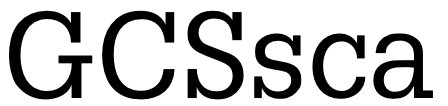
On the other hand, the more "dynamic" slabs I looked at (most notably, Caecilia and TheSerif), which tend to have less 'curvy' Ss, have the serifs on the inside of the curve, which also happens in the G and Cc and even connects to a little serif-like terminal on the hook of the a. (I like that.)
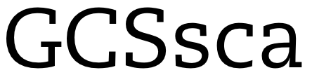
Then there are those with serifs on both sides of the curve, such as Grover.

Plus, I've also found some special s designs such as Archer with the little ball terminals, or even this asymmetric one in Kofi.
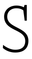
So, any opinion on which way is 'better' (any differences re. readability, openness of shapes, problems when making bold weights) – well I guess in the end, it is a matter of preference and most of all, of fitting into the general "curvature" of the typeface?
Also, does my original assumption hold true that certain Ss serif designs are inherently connected to certain styles of letterforms, and one should not, for instance, attempt to make 'inside' serifs on a geometric slab (by opening up the curves a tad to fit them in – ok, that would make the face a lot less geometric)?
Or is it totally OK to design the s either way, judging by 'eye' in terms of it working / fitting into the alphabet? (Either way of course making sure the correspondence to Cc and G, and if applicable, a, is there.)
Thanks for any pointers and/or opinions. I hope this wasn't too confused. :)


