Hi,
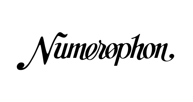
I'd like to get your thoughts on this design I drew up. The focus of the label is old-time American folk, pre-war/post-war blues, and the like. My aim is to create a clean script logotype, with some of the quirks and charm of a hand drawn logo of that era, while still looking well-crafted.
Anything you would change in the weights, kerning, curves? Should I round out the hard edges? I will be staring at it until it looks perfect. This started as a (crude) hand-drawn sketch and was traced.
Thanks in advance!
-David