
Hello.
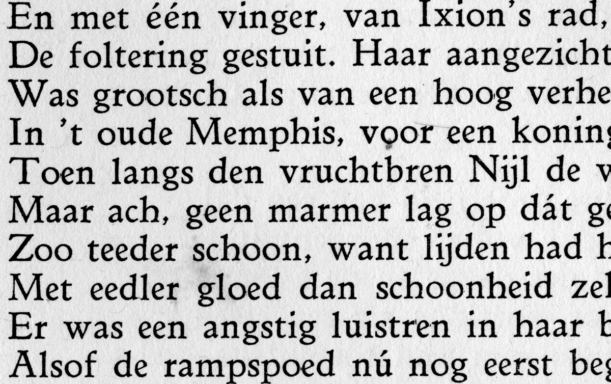
Can you help me identify this typeface?
The book was printed in 1927.
The language is dutch, printed in Wereldbibliotheek.
Thanks very much.
Jano
Hello.
Can you help me identify this typeface?
The book was printed in 1927.
The language is dutch, printed in Wereldbibliotheek.
Thanks very much.
Jano

Looks like a version of Jenson.

Sabellicus is a fairly close, though by no means perfect, digital equivalent.
Also Italian Old Style.

This scan has me thinking about the principles which guide my approach to type design. By most measures it could be said this face is inconsistent and awkward. My instincts say, the e/u are way to narrow -- except for the é which is better -- and the h/n are from different planets. Thus begins the process of ironing out all the quirks, stripping the life from (my) type. Case in point, I always hated Weiss. It's so campy amateur in its details (see the s). But now it’s growing on me in a Frank Heine Tribute kind of way. Certainly there is a balance to be found between quirkable and workable, especially for text. But I am inspired to crank the dial a few notches back toward quirky.
Anyhoo, I have no idea what this type is. It is both bizarre and beautiful. Thanks for posting.
I had similar thoughts when I saw Christian's typeface for the Houston Chronicle. I love that the many layers and complexity of type can often prove myself wrong.
I can say, the typeface has really nice text image, when I look at printed page.
The details are strange, I agree. But it is ok, in small size, like it is.
I will maybe try to look in old Monotype specimen in library.
Thank you very much! Thanks for your time!

the fruits of searching... I found this thread, and another which has the answer:
“I'm not sure if a digital version exists...”
Mark found the answer (Linotype Benedictine c.1920) and posted some further specimens.

I tried to read a book by Hendrik Willem van Loon in 1947 in this type, and gave up. I got too distracted looking at the fresh juxtapositions of the varied character groups going by and couldn't concentrate on the text!
Thank you very much. It is really Benedictine.
Now I don´t need to search in the library for whole day...
hyperion - benedictine revival
Captured from web.archive.org on 16 Oct 2013. view this capture