
Ok, so here is my first approach on typeface design, any thoughts or suggestions will be very appreciated,
Thanks
Julián Moncada
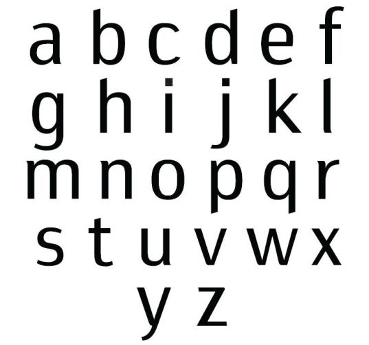
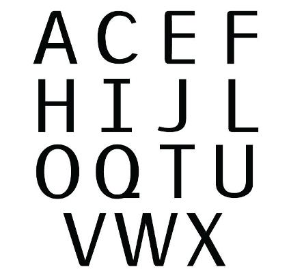
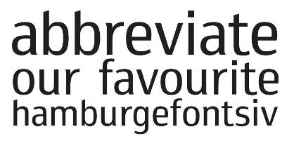
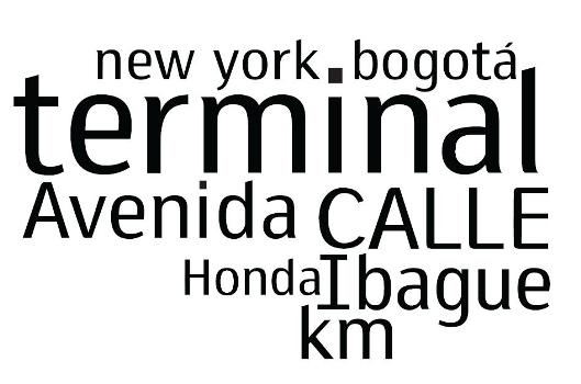
Ok, so here is my first approach on typeface design, any thoughts or suggestions will be very appreciated,
Thanks
Julián Moncada
I can't help but feel that this face would be better off without the sheared ascenders. But that may be a matter of taste. The only thing that really looks malformed to me is C/c (the bottom half specifically). And even though your ductus is mostly horizontal, you probably won't escape the common reaction that the A is backwards.

Hola Julian,
Si, la A tiene un contraste invertido y las curvas de las esquinas en las mayusculas probablemente son innecesarias. Ojo con las proporciones de C, E, F y J.
Ya casi! Felicitaciones!
César Puertas
www.cesarpuertas.com
cepuertas@hotmail.com

Upper left curves of lc d and q are different - on purpose?
Captured from commoncrawl.org on 26 Apr 2015. original URL