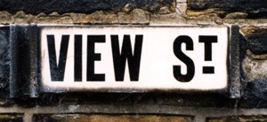
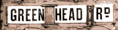
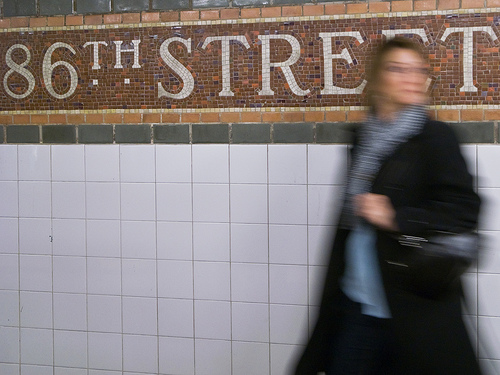
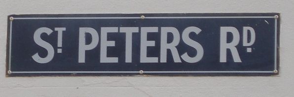
While absent mindedly sketching out ideas for a wedding invite due to take place at St. Paul de Leon Church, instead or writing St., I made the lower case 't' superscript and place the dot underneath it.
After pondering where I had seen this treatment before I remembered some old St. John's Wood tube station signage which uses it and after a further search the only other example I could find was the new image for St. Pancras station (again, London transport based!)
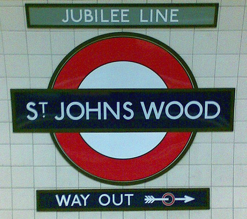
Can anyone shed some light on this arrangement? Presumably it has a historical context? Is there a right and wrong way of using it? Is it ever drawn as a single glyph or is it up to the designer to decide the relative scale and arrangement?