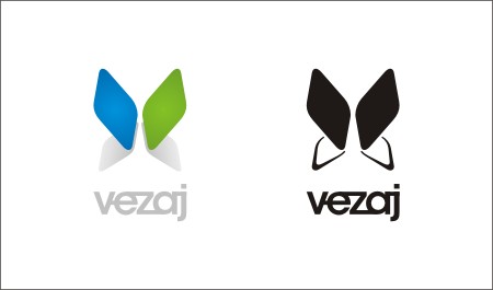
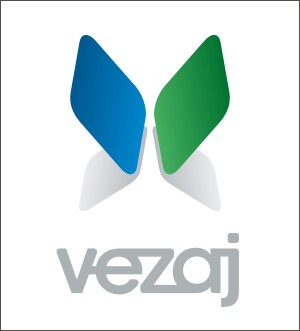
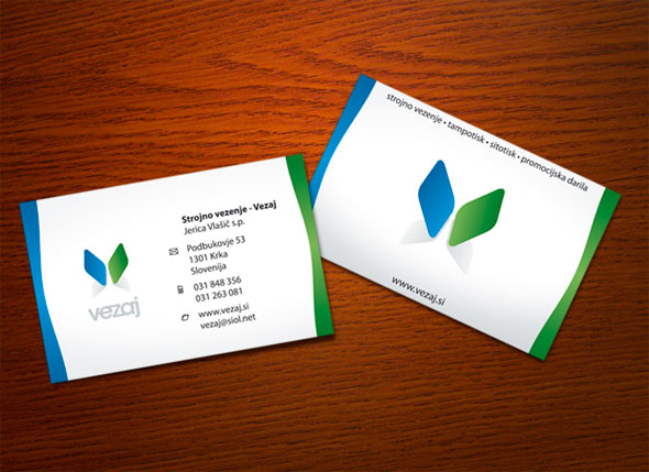
I'm working on a logo for a company that currently does embroidery promotional gifts (caps, T-shirts etc.). Right now their logo is second to non existing. They want to have one. I was playing a bit with the idea and came up with a few. Three of them are presented in the PDF. If you could comment on them.
So the logo should reflect professional promotional gift producing company that may handle complicated custom made works. Since I know them personally I know they are very dedicated and very accurate at their work. So their products are really fine produced.
BTW. Name as in logo #1 hides a word "stitch" (in our language), their original line of work. That's why I was thinking not to go completely into embroidery symbol since the name implies on it already. And I know that the end result will contain at least three basic colours (red, blue and yellow).
I would like to know which of these is worth pursuing if any at all. And if they also maybe remind you of any other logo.
| Attachment | Size |
|---|---|
| Logo Preliminary 1 (09.10.08).pdf | 16.19 KB |
| Logo Preliminary 2 (14.10.08).pdf | 4.15 KB |
| Stationery I (17.10.08).pdf | 34.23 KB |


.jpg)