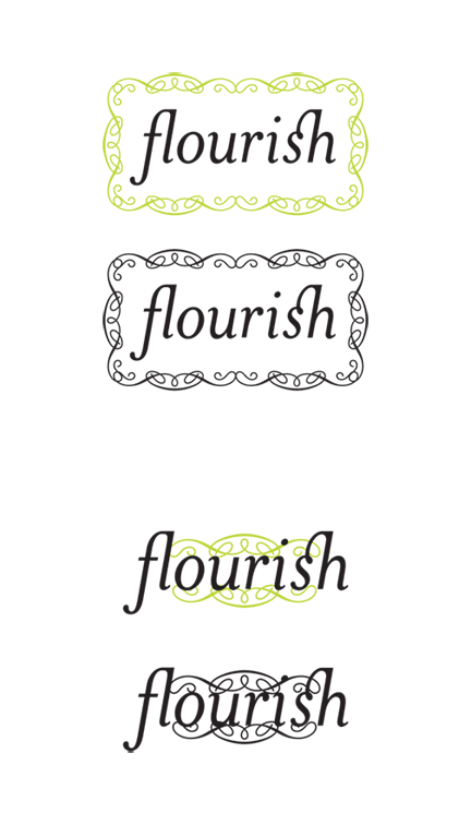
So I’m trying to come up with a brand to pull in some freelance design business. I don’t want to use my name because it’s difficult to spell. So far the best I’ve come up with is “flourish”. I chose it for it’s double meaning.
Here’s my first attempts at a logo. Is it too obvious a choice?
I wanted to try using Emigre’s Tribute font because it looks like there’s some nice ligatures in there but I can’t cough up the money for it now. Does anyone know of similar fonts families? I’ve gone with Mrs Eaves for now.
First impressions of name and logo? Any suggestions for improvement?
Thanks in advance.