Typophile

Logo type suggestion (friendly, playful, readable)

Jasonrobb

Background: The client is an agent for study abroad language learning. The purpose of their company is to help students research and book study aboard language courses. The media is mostly web, although I suspect biz cards will follow. Message should portray a reputable and trustworthy source for honest comparisons of language schools and their courses. The typeface will be for display. There might be illustrations with it, most likely a friendly looking “agent” or “counselor” type person.

Here’s what I have in mind so far.

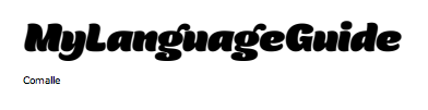
Looking for something friendly like Comalle...
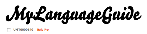
Playful like Bello pro...
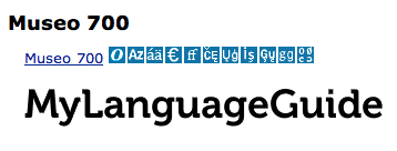
Readable (and a little more serious) like Museo...
Asking for suggestions on which typeface might do the job well. As well as some inspiration.

I greatly appreciate any feedback/questions. Thanks very much!

(First-time post, long-time fan of Typophile! =)

I would suggest Archer by Hoefler & Frere-Jones, it’s super friendly and you can definately find a weight that will work for anything you need.

http://www.typography.com/fonts/font_overview.php?productLineID=100033

- Scott Sullivan
www.trifepdgm.com

Scott,

Great suggestion! However, I’m looking for something a bit more informal than Archer.

Archer italic does have the well-rounded friendliness I desire, but it’s not quite playful enough. A worthy adversary on Museo’s playing field. Although not close enough to the hand-drawn feel of Comalle. Definitely going to keep Archer in mind.

So glad you reminded me of H&FJ. Thanks!

Jason R.
www.jasonrobb.com

I think Comalle is really fun, but dangerous for an identity as it’s not going to perform any smaller than you display it here. It was not made for business cards. Bello would need some modification to make it readable, and that’s quite the task if you’re not experienced as a letterer or type designer. Museo ain’t bad.

Other ideas:
Rayuela Chocolate - slightly more open counters than Comalle, lighter weights too
Pedestria
Grenadine
FF Kosmik
Co Headline
Bree

I think that Rayuela Chocolate is a nice suggestion for what Jason is after. Not sure if I like the weight of the caps in relation to the lowercase.

Whatever you choose, don’t forget to customise at least some of the letters in order to make the logotype unique!

Have look at Sauna (bold or black, bold italic, black italic) or Omnes (black italic)
http://www.vllg.com/Underware/Sauna/mudTyper+Weights/
http://www.dardenstudio.com/typefaces/omnes

I think Stefan’s Oxtail Black Italic would be interesting. It is very readable at business card size.

Sharon

Thanks everyone, awesome suggestions! You didn’t let me down.

@Stephen: Good point, I was thinking that about Comalle as well. No smaller weights either. I’m a newbie type designer, so any modifications I make will be minimal.

@Jos: Yep, I agree. Rayuela Chocolate italic is right up my alley. Yea, I see the lack of contrast in the caps to lowercase.

@Stefan: Yes, I plan on it! Thanks for the reminder and encouragement as well. (I promise I won’t hack up anyones hard work. If I must, I will contact the type designer directly and ask for their help.)

@poms: I’m considering Sauna, although it looks a little too “fat kid eating marshmallow’s” for this identity. ;)

Omnes is a great suggestion, I’m digging that a lot! Will seriously consider.

@Sharon: Thanks for the sample! I’m not quite sure a slab serif feels right. Appreciate the suggestion, of course. =)

I’ll keep you updated on which I decide. Thanks again!

Sharon,

Thanks for calling out Oxtail. ;-)

Oxtail fits the bill well but I feel like it is very heavy (Did you use Black Italic?).
Perhaps if it was not set in black or if you found a lighter weight. Have you thought about the color?

I did use the black italic. :-)

@Pentapus: I have thought about color schemes for the identity, but not specifically for the logotype, yet. The overall identity will most likely be blue, green, yellow or a combination of one of them. Reinforced with tinted whites and blacks, probably not straight white or black though.

I’ll whole-heartedly consider Oxtail, although it wasn’t love at first sight (for this identity). I’ve added it to the sample type wall.

I’m leaning more towards Darden Studio’s Omnes, at the moment.

Thanks again for the feedback and suggestions all. =)

Captured from web.archive.org on 10 Dec 2008. view this capture