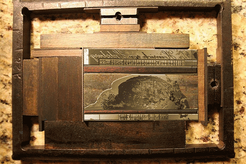
What is this for...err...it’s a little difficult to explain.
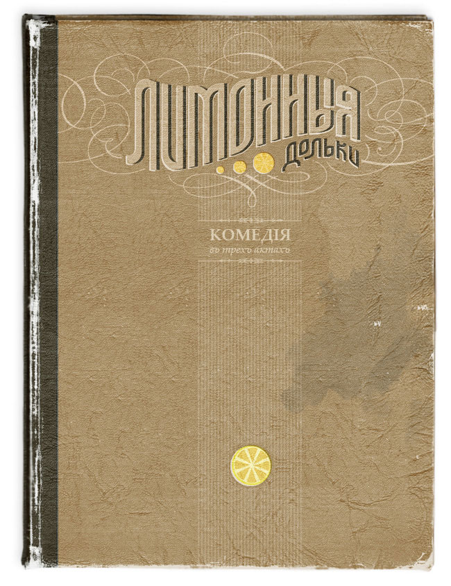
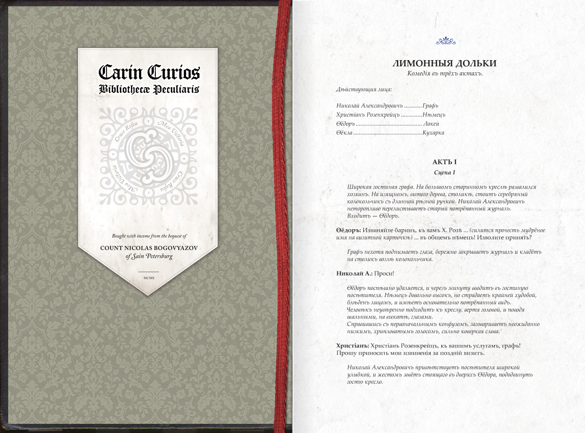
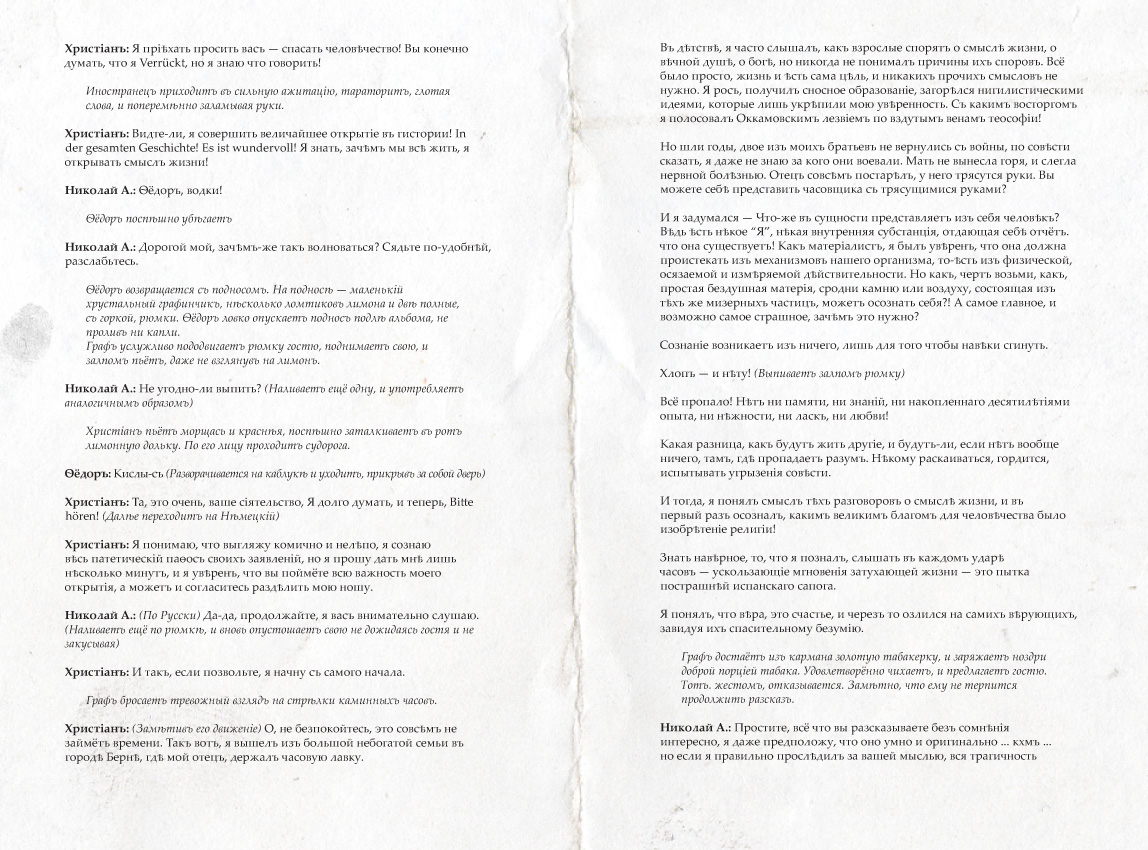
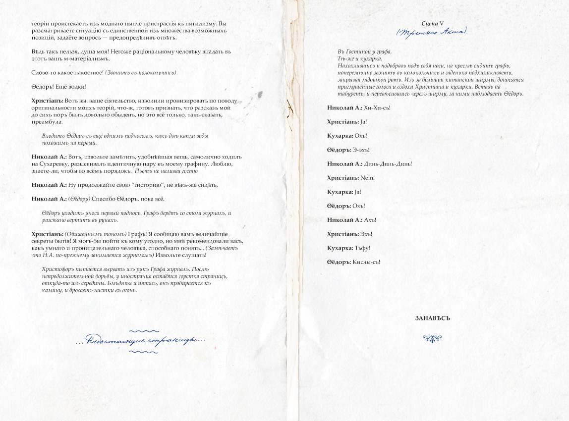
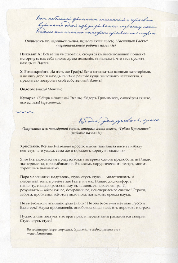
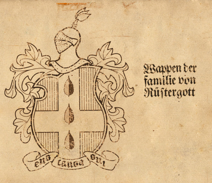
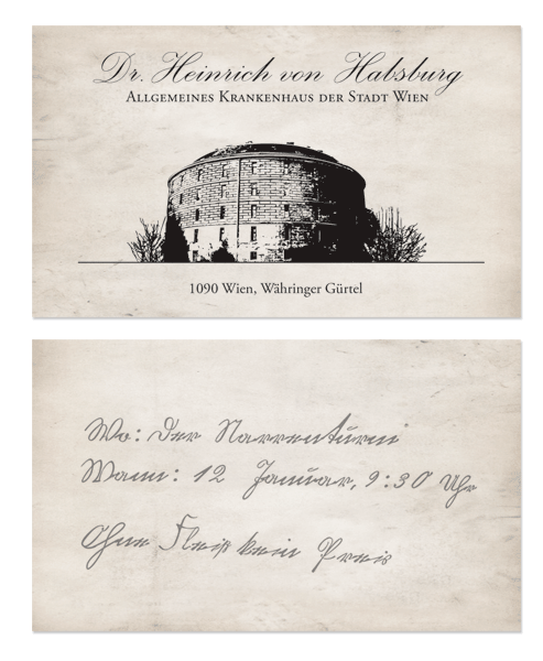
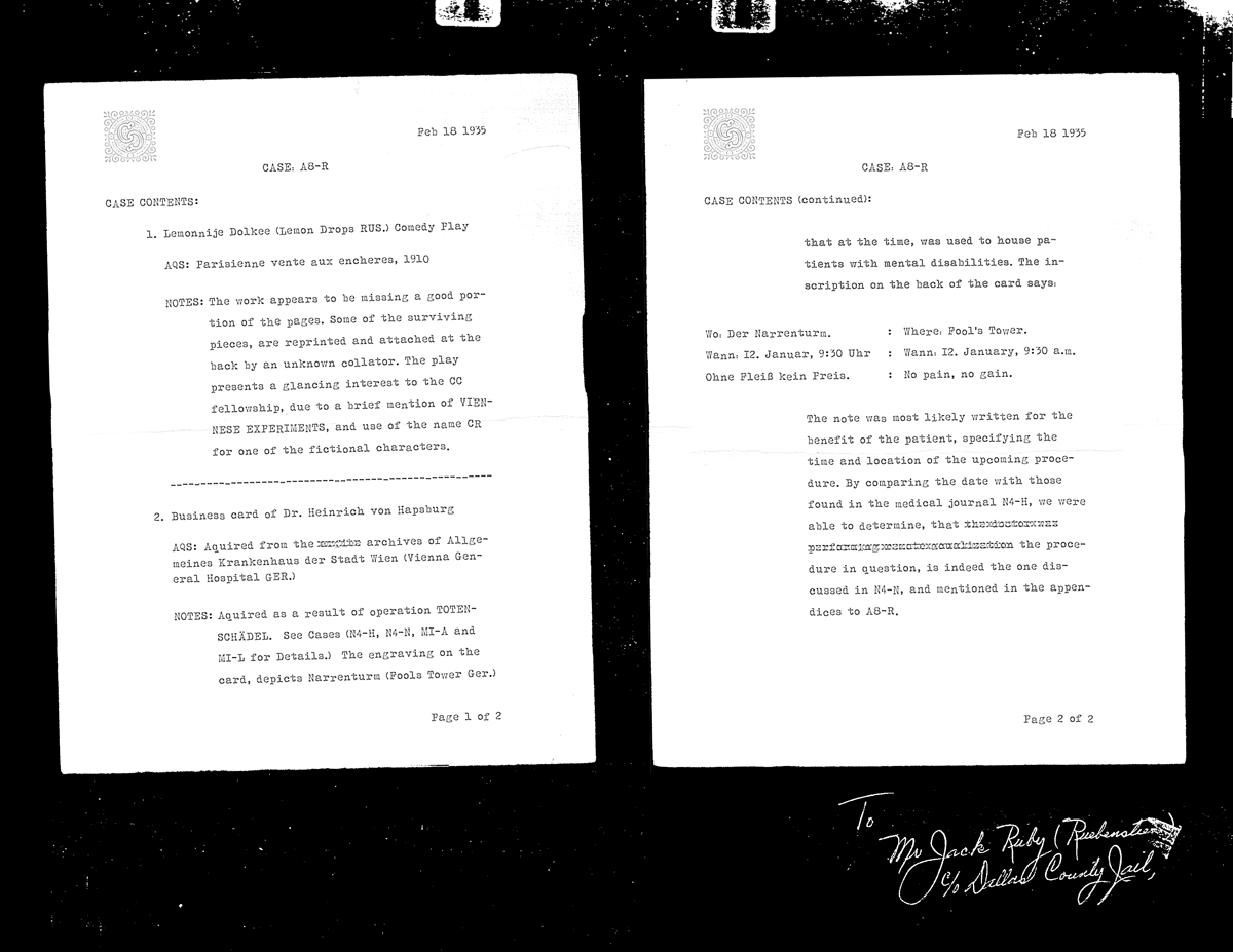
Basically, it’s just a personal project. I am designing various paraphernalia to accompany a short story, that I’ve written (badly) in the style of 19 century Russian plays. So far, I have the cover and remaining pages, set according to the rules of pre-revolutionary orthography, a business card of a German doctor working in Viennese Krankenhaus, a photocopy of a catalog page, and a picture of the family crest.
There is no real point to any of this, just idle play in the spare time between the boring in-house jobs. At the same time, I want to make sure everything looks and feels as authentic as possible, without major anachronisms. I am trying to watch my styles, content and typefaces, packing the imagery with a plethora of hidden clues. Does anything immediately jump out at you as either historically incorrect, or aesthetically appalling?
The Cover of the play
The Page spreads with rip marks and added scraps.
Bogovyazoff family crest.
Business Card
Photocopy from the CC archive
I hope this isn’t too long.