Typophile

Near clone of Optima on early rulebooks for Traveller role-playing game (late 1970s-early 1980s)

hammerquill

Hello all -

Mostly for the thrill of the hunt, I’m looking to identify the typeface used as display type in the early rulebooks for the Traveller role-playing game from the late 1970s and early 1980s. After a few years the display face changed to Optima, and the differences were very slight. In fact, there are examples where the two are mixed, with an old logo and new Optima type above it.

Overall, the face is extremely similar to Optima in form of almost all letters and punctuation I’ve seen, oblique and roman both. The oblique form is more upright than Optima’s though, and some letters like F and L may be more condensed.

The mystery face generally has softer edges and is less delicate, with less cupped terminals. Actually, it often tends to look like a badly worn letterpress font of Optima, and maybe that’s where the maker started from. But there are a few letters that are quite distinct in form. The most obvious is A, which has its righthand stroke continued above its lefthand one. Its crossbar is also high. It’s distinctive, and is one of the reasons I want to find this face, which otherwise looks like a fairly mediocre knockoff of Optima.

Here’s a bit of the logo in mystery face and in Optima for comparison of oblique caps, including the A:
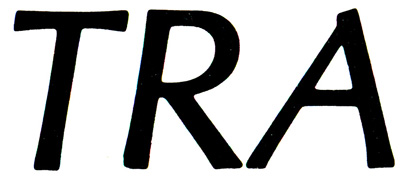
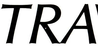
I should note that the A is this same shape in plain roman, too, not just in the oblique form.

The other differences I’ve noticed are

1) the apostrophe (or single quote), which is a sharp triangle in the mystery face, unlike the rounded pinball-flipper shape in Optima:
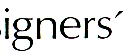
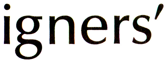
(Try to ignore the fact that the Optima sample is a heavier weight - when they’re the same weight, most letters are nearly identical.)

&
2) the y, which has a curved tail in the mystery face, unlike the sharp triangular end in Optima:
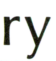
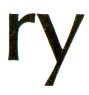
Other than that, differences are subtle to non-existent within the letters I’ve been able to compare. I haven’t found a Q or a J to compare anywhere, nor most non-alphanumerics. 1, 4, question mark and comma do match Optima quite well.

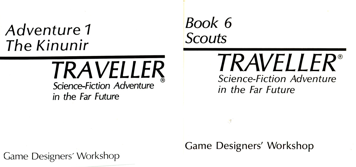
The front page of two books, with mystery and Optima (from which the TRA samples above were taken), can be seen here. I can scan other samples if anyone wants other specific letters, but as I said, I haven’t found any others that aren’t virtually identical to Optima.

Did someone take some Optima and add a new A and y, and change, basically, nothing else? Anyone know what they called it?

Thanks in advance for your attention and help!

bump!

No replies yet. I’ve got a bit more information. I actually contacted the game designer, who says that Optima was specified from the beginning. This means either the printer said “oh, this one’s close enough,” or the printer had a face that was called Optima, but wasn’t real Optima. I expect it’s the latter, because the text face of these early books is an odd, corrupted form of Univers, with the e and a couple of other letters much too condensed for the rest of the face. When the display face becomes real Optima in later books and printings, the text becomes real Univers.

I have also found examples of both Q and J. J is more or less identical to Optima. Q is quite different from Optima, with the tail a straight bar crossing from inside the bowl to well below the line at about a 45 degree angle. (I can scan if anyone’s interested.)

If I’m right about the face, though, probably the only hope of finding it would be in the catalogue of whatever company sold the font, back in the ’70s. I can always hope, though...

Sorry I don’t have enough time to write up more details and provide source files, but Optima had many licensed and unlicensed variants during the 1960s-1980s.

During that time many printers and designers used type output from multiple sources; hot-metal (often resized by camera), press-type, IBM Selectric, photo-headline, phototype, and closer to the eighties - CRT typesetters and the first generation digital imagesetters.

Given the fact that optical adjustments were made by type designers and type foundries to visually optimize the font when used for text versus headlines, you often saw these variants within typefaces at different sizes.

So just multiply the variables — many licensed/un-licensed versions of Optima x display/text versions x various technology = design variants.

I know of at least six Optima “versions” I used during that time.

Thanks, Norbert. This is pretty much as I expected. Probably the main logo (from which the ‘TRA’ above is taken) was scaled up by camera - it would fit with its look.

These are not expensively designed or printed books, so the designers were not going to great lengths with tailoring the typeface for them, I’m certain. Presumably it’s a version (licensed or not) of Optima that was floating around.

I was hoping that someone would be able to pinpoint the actual variant, based on that distinctive A especially, and tell me where it came from. But I know it’s a longshot.

I found this page of ‘font aliases’ interesting: http://desktoppub.about.com/cs/findafont/a/fontaliases_o.htm

It suggests clones named

* CG Omega
* Optimum DTC
Ottawa
* Zapf Humanist 601 BT
Athena
Chelmsford/II
Musica
October
Optimist
Orleans
Ursa
Zenith

I was able to find the ones with * asterisks online easily (and Zapf Humanist everywhere, of course), and they are at first glance precise copies of Optima. No interesting variants. My few type books are all very above-board and legitimate, so they don’t have the shady stuff. Nor have I seen any reference to legitimate, licensed variants of Optima. But my resources are few.

I helped launch CG Omega when I was at Compugraphic/Agfa. This was preceded by the infamous “Oracle” version of Optima made during early days of Compugraphic, and before the font library became “legitimate” during Agfa ownership.

Sorry I didn’t catch this thread earlier. I recognized this right away. It’s Chelmsford, the clone of Optima that AM (Addressograph Multigraph) had for their typesetting equipment. I always hated what they did to poor Optima, making seemingly random and pointless changes to a few letters, apparently to avoid being accused of font piracy. I still cringe every time I see it—which isn’t often anymore, but happens. There is a trucking company that still uses it, so I see it whizz by on the freeway now and then.

AM had the oddest taste in naming their knock-offs: Melior was called Mallard; Helvetica was called Megaron. A duck and what sounds like something from a Japanese monster movie. And Chelmsford—a British-sounding name for a typeface by a German designer inspired by Italian stone-carved letters. Brilliant.

What a great thread. I still remember pouring over the typebooks that different typesetters had, all with different names for similar (based on the same) typefaces! It took a lot of sleuthing then too...

It’s Chelmsford, the clone of Optima that AM (Addressograph Multigraph) had for their typesetting equipment.

Cool! This is exactly what I was hoping for hereabouts. I’ll have to see if I can dig up a full specimen sheet of AM Chelmsford. I doubt anyone’s digitized it - there wouldn’t be much point. It is a rather poor copy, and mostly pointless, but that A I do find interestingly done, and quite distinctive, and it’s solidly stamped into my consciousness as part of the logo for the game, and therefore a part of my adolescence...

Thanks, Mark (and everyone). Glad I found this place to ask.

It was Compugraphic itself that documented that Chelmsford was a ripoff of Optima.

http://www.sanskritweb.net/forgers/compugraphic.pdf

see page 6, left column, sub voce

Yes, I have that book. The Typeface Analogue was produced essentially as a marketing tool — a handy “reference” for look-alike typefaces. Several other foundries produced them, Bitstream had one as I recall.

I wouldn’t advise using the Typeface Analogue for accurate historic reference.

Captured from web.archive.org on 13 Oct 2008. view this capture