Typophile

Dechenko

Natasha Fernand...

hi, everyone,

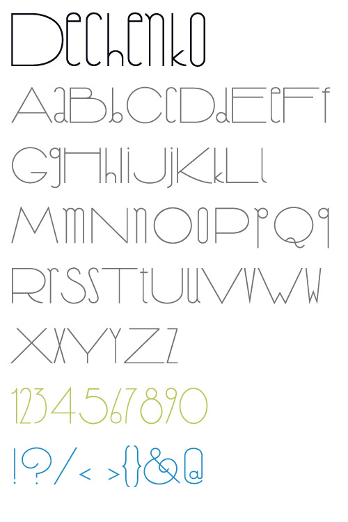
my name is natasha, i'm a senior at the school of the art institute of chicago studying drawing along with "art & technology"... which really doesn't have anything to do with type design but i really love doing this! i'm still learning a lot about it, and have made some things in the past that are pretty whack but this is going nicely, i think. i'd like some feedback on my latest font, "Dechenko," which is a kind of deco-futurist font i've been working on.

some questions i have about it in particular:

+ i've been having a lot of trouble with capital S. none of the ones i draw seem to fit. have you seen similiar fonts like this that i can use as inspiration for my s?

+ the numbers are varying widths. i thought this might make uses where there are a combination of numbers look more dynamic. is this ugly?

but feel free to say whatever you want. i've been lurking on this forum for about a year now so i know you guys are really critical and that's exactly what i need!

(also, if you could tell me what the best way to go about this is, should i have posted a PDF? i see that others in the past have.)
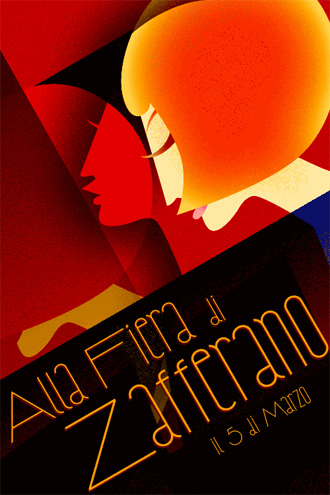
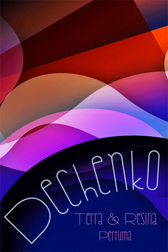
I love the symbols. I think your S is quite nice; the fact that it is not fully as big and wide as the other caps is not as much of a problem as you imagine.

As for the numerals, for practical use there should probably be more choices. Make a wide set in the LFs and a narrow set in the OSFs (an open-topped rectilinear 4 in the narrow set would be cool), and then users could mix and match them at their own discretion.

I like it as it is, even though about the figures I think 3 should be the same width as 5; also would be best to "spice" the alphabet with some additional alternates to choose from. Regarding the capital S, looks OK to me. Though I would love seeing an alternate Q with more distinctive tail.

Posting a PDF is not a requirement, but sometimes it helps to see the design up close, in more detail. But some people prefer rounding off the design first...

The capital S looks fine to me too. What would an esh shape look like for the lowercase? You could maintain a straight vertical line with a right facing top hook and a left facing bottom hook.

«El futuro es una línea tan fina que apenas nos damos cuenta de pintarla nosotros mismos». (La Luz Oscura, por Javier Guerrero)

Captured from web.archive.org on 17 Apr 2015. view this capture