Dear Typophile Geniuses,
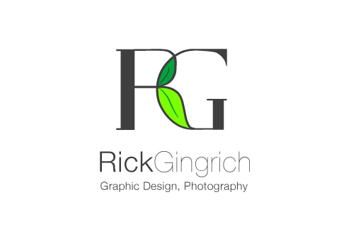
I've been dabbling in freelance design for the last year and I've been a photographer for several years and finally decided to make a logo for myself... It's still a little rough, but I'd like some feedback/critique on the idea and the general icon. It's nothing too fancy, I am just using my Initials for the icon, the lettering is based off Didot. And the name is in Helvetica Neue (But I'm sure you all already knew that) :).
The leaves would represent "Fresh Ideas" I guess... (I didn't put a lot of thought in the symbolism). I had the idea that I could change the color of the leaves with the season if I wanted to, or have something growing out of the icon horizontally...
The one worry I have is that "leaves" don't necessarily = design and photography.
Your comments are much appreciated!