
Hi There
I'm working on a redesign for a small local Dutch newspaper with a printrun of around 25.000 copies. Here some digital sketches.
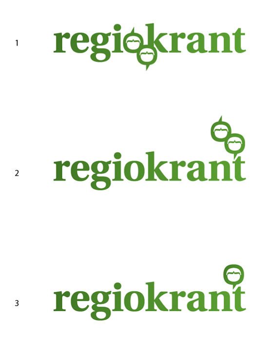
This local newspaper attends an area where there is little to none interest from the mayor newspapers being spread around here.
The area this newspaper services is close to and within a city (Groningen) where there are quit a few newspapers. However, all of these are focussing on the city itself.
The "Regiokrant" connects a few villages around Groningen with a few districts of Groningen City. All – geographically – are neighbours. This paper brings them closer together.
Beside this it brings quality. Readers tell them that unlike those other papers, this one they like to read because of the stories. With them the glass is half-full instead of half-empty. This positive approach is appreciated.
I have tried to reflect this in the logo.
People interact with people.
In the balloons (the outer shape of the 'O') you find two men. Not in number 3.
By the way: Don't mind the colorscheme. I'm still working on that.
I'm thinking of giving them an emotion, but am still pondering which emotion would be best. (Happy, curious, interested ...).
But I want to do this with as little elements as possible.
Oke. Here my question: Does image number 1 read as "regiokrant"?
And second: any other comments?


