
Here is a wedding monogram I am working on for my brother's wedding. My soon to be sister-in-law is excited to have the elaborate swashes in the monogram. Let me know what you think of the forms. Thanks
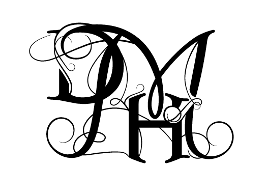
Here is a wedding monogram I am working on for my brother's wedding. My soon to be sister-in-law is excited to have the elaborate swashes in the monogram. Let me know what you think of the forms. Thanks

Slightly over the top, in my modest opinion.

Slightly?

It looks like it was poorly live-traced in illustrator. Are you going for a more organic letter-form feeling?
For me, the forms are too broken up by the swashes and don't really look well crafted or well integrated. I'd suggest coming up with more variations on this that use different letter placements. For examples on swashes and similar letter-forms, I'd suggest looking at the sudtipos type foundry. They have a lot of great script fonts with lots of open type options.
Also, it looks more like D&MH, not D&HM.
penn

It being a wedding, my wholly uneducated opinion is that OTT is expected…however, the M is overbearing and does make it look like D&MH.

There is no coherency. It is too much.
It is more of an illustation. Not a well one, I'm afraid.
Very cluttered. Sorry.

wow, this monogram is a bit hard to read as is.
size it down to 25% and have someone who has never seen it and does not know the couple read it.
if they cannot decipher the letters, you then should reconsider a simpler route.
Captured from web.archive.org on 23 Aug 2013. view this capture