Hello everybody,
I have recently started to learn about font design and attempted to generate a Helvetica-like sans serif (see also my font post: http://typophile.com/node/49228). I have some problems, however, in getting the fonts to display smooth at different sizes.
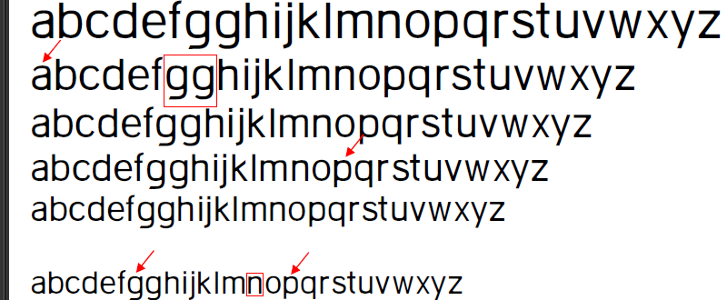
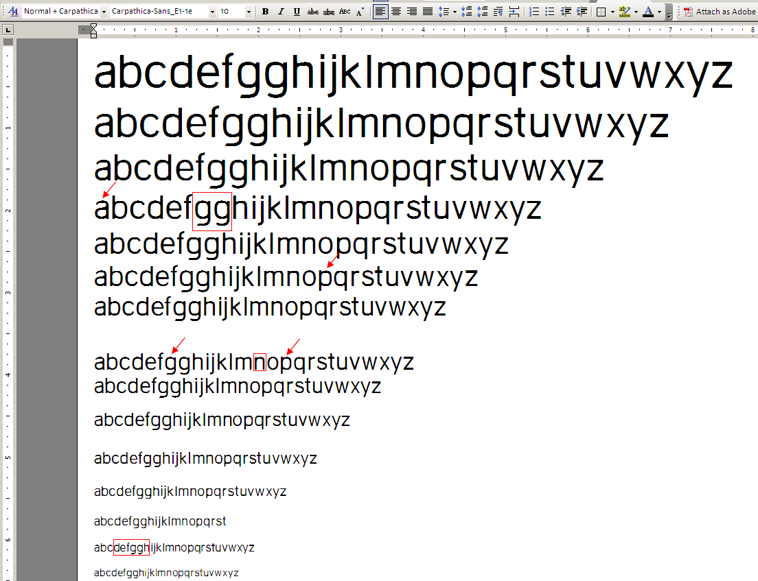
I have noticed that when using the font in Microsoft Word in contrast to Acrobat some of the curves are rendered very badly - see the arrows in the image bellow.
Question: What one can do to make sure that fonts are displayed smoothly in Word at various sizes (OS: XP with Cleartype turned on)
- are there special design methods needed, is it a matter of metrics, or it is a problem with the outline shape i.e. bad design (the font is in a very early stage)?.
Thanks in advance for any advice.
Word:
Adobe Reader: