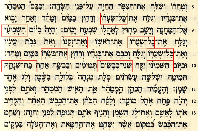
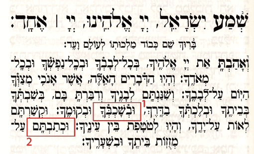
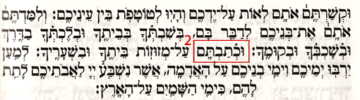
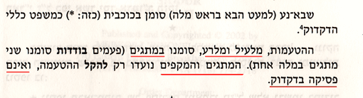
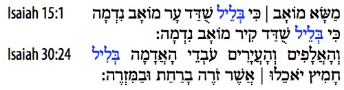
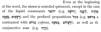
Here are Hebrew Type Design specimens from Mr. Raphael Frank's important little book on Hebrew type designs and its history, printed originally in German, and translated later into Hebrew. An English translation doesn't yet exist. His ideas and opinions are quoted in my English language book on Hebrew Typography.
Frank's contribution to Hebrew type design was significant and influenced Jewish culture due to its enormous impact upon modern Jewish and Israeli societies. These samples include rarely used examples of different type style designs, demonstrating his intense love and knowledge of Hebrew type design.
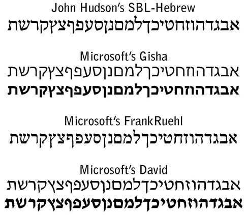
Frank designed and created the popular standard FrankReuhl type style. No other type design has been used to a greater extent for the Hebrew language in the twentieth century and beyond. In the eighteenth and nineteeth centuries, the Merubaas typeface, and its derivatives, were the book publishing stand typeface. Since then, it was replaced by FrankReuhl. Over the past fifty years, Hadasa, David, and Narkiss, have attempted to upsupt FrankReuhl's dominance and have failed.