Typophile

Best Typographic Beer Labels

This thread ran to 3 pages of replies and only 2 were recovered, so replies are missing.

The capture this came from was cut short by the archive that made it, so the text may be incomplete.

I'm surprised this hasn't come up before, but typographically what are your favorite beer labels. There are so many hand scripted/lettered versions out there!

Personally, I like the Leinenkugel logo. [ http://www.leinie.com/av.html ]

and [ http://www.schneider-weisse.de ] The Schneider and Sohn's Shneider Wiesse logo

and not so much for taste, but for script skills:
[ http://budweiser.com/ ] the Budweiser logo:

Well, considering the current flair for "GREEN" design, it's probably quite cliche to expect a sustainable brewery to follow the trends of hand-lettering to symbolize that they're eco-friendly, blah blah blah...

I was just remarking that I don't associate Copperplate with that whole "Green" motion.

I do like the New Belgium logo, and the type selection does work well. They must be doing something right because I wish I had more access to their beers. I've even commented directly to them about getting more of their beer in PA. They said that because the distribution distance is so great, they couldn't justify shipping that far. It goes back to their earth-friendly approach and desire to reduce their impact on non-replenished fuels. I guess I'll have to wait until their are more electric freight trucks on the road till I can have a cold New Belgium in PA.

"Soon enough hand-lettered will stop saying “eco-friendly” and “independent film” again. What comes around goes around."

Miss Tiffany, are you speaking of naive forms or refined lettering solutions. Better yet, what are the perceived differences between the two? Is not suitability the discerning factor? Should I start a new thread or are my questions stupid?

Michael

Two of my favorites:

Jayyy, you beat me to the punch with the Carlsberg, clearly one of the best.

And who can forget Generic beer?

Here's mine... it's got chutzpah, even if the layout is a bit confused.

Maybe it's more the logo than the brand or hand type. (white ale)
It's immediately memorable.

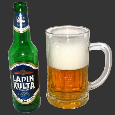
One of the nicest Finnish ones:

and two other popular ones:

Mili, send one of those over, any beer with such good taste in labels surly must be good tasting!

ChrisL

Here is a Portuguese beer label.
Not the most popular beer but with a nice label!

António

Miss Tiffany, are you speaking of naive forms or refined lettering solutions.

Today the OT tech is so advanced that we can be tricked. But I'm speaking of the façade, so perhaps refined lettering solutions. I'm generalizing, of course, as there are honest and appropriate reasons for using this style of typeface/lettering. I'm mostly bored with it becoming a go to sort of way to achieve a look without really considering if it is the best and/or most appropriate answer for the problem at hand. So I do agree with your second statement.

I guess what I am asking is how can hand lettering speak to eco-friendly. Sure you can use naive (or rather ill-informed letters) to suggest "I am green" but that is a graphic ruse that has been perpetrated for many many decades. You can also bore potential consumers with minimalist "Less is better" (see above) and say the same thing. It is the whole generic brand fad. As to it looking elegant or rough around the edges, it is a "product of the product." It is not green or sheen, just job specific.

I guess I am surprised by some of the comments about lettering. It is almost as if it is thought that lettering is a flash in the pan. Nick even said something the other day about the script "fad." Scripts have been being produced one after another, AND applied to product, since I have been at this, several decades. I have always perceived what we lettering artists do is enhance the "product" when nothing else will do.

No argument from my side just pure curiosity as it affects what I (and others) do and how lettering is perceived by people of "the tangential letter mind."

Michael

Ah. Ok, first while I do agree there is a huge "fad" right now with script fonts, I don't think it will die out, but mutate into new styles.

Second I didn't mean to say that lettering is a flash in the pan. Not at all. What I do think is there happens to be a lot of people using naïve looking fonts/typefaces/lettering on indie films and products where they are trying to convince us that it has been hand-held (cared for?) from the beginning. As if to say the slicker it is somehow the less authentic it is. Does that make sense? Maybe we should start a new thread.

Considering the hand-crafted nature of beer, a signature script seems most appropriate. I agree with Tiffany, standard out of the box fonts, just don't seem right on a label. They need a touch of character.

It's like setting wedding invitations with Times New Roman on a word processor. Just doesn't have that extra care and diligence that makes me think there was some actual thought and talent put into it.

I don't think beer labels have to be script or hand lettered. A good graphic designer can easily make type work.

ChrisL

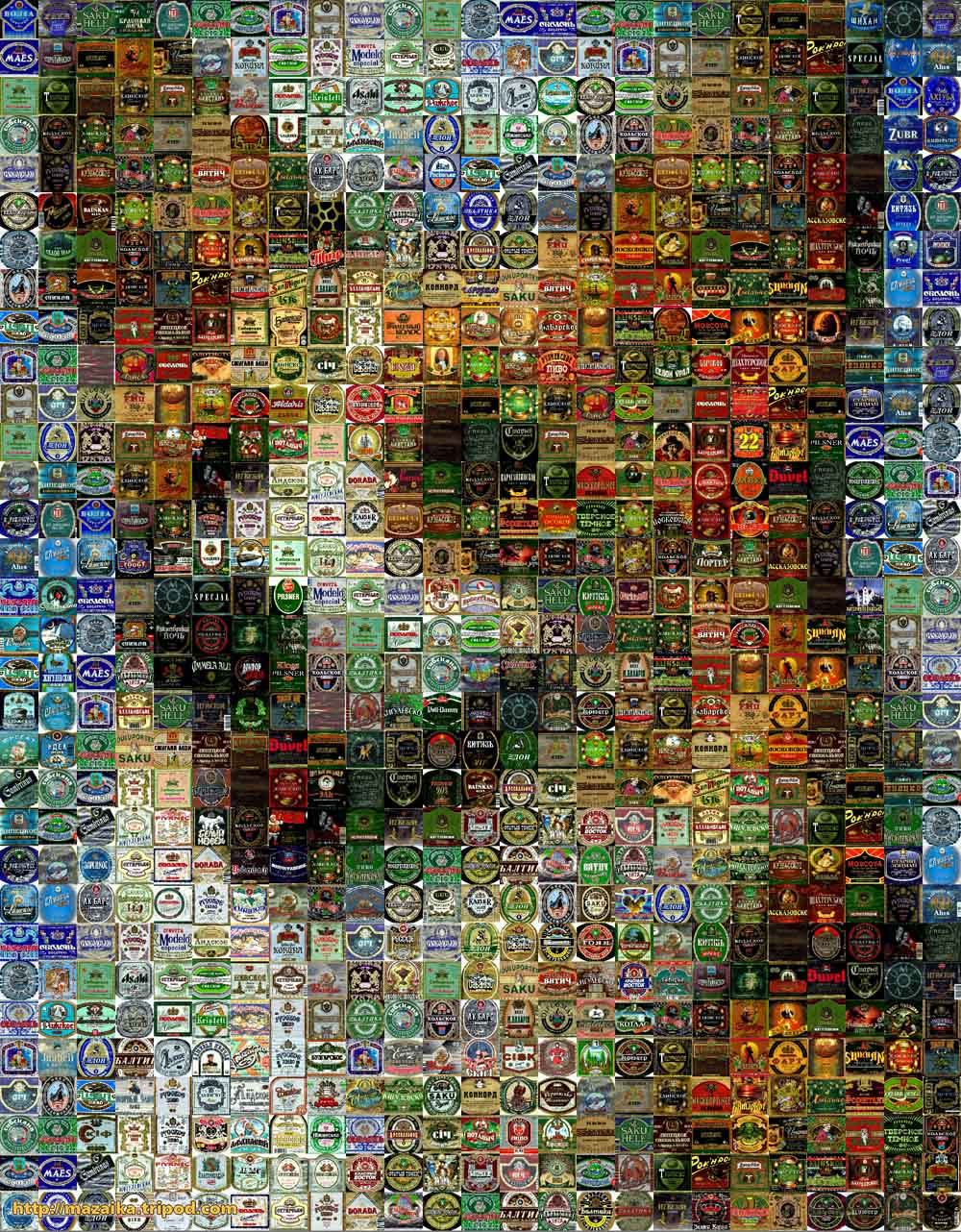
as of me this is interesting

and hear many more if interest is
www.nubo.ru/pavel_egorov/new98.html

ChrisL

Is that my mouse pad? Nice improvisation Chris. Can one get warts from handling the bottle?

Miss Tiffany, it does make sense. It was just difficult bouncing between the posts and putting it together in my brain in a cohesive fashion.

Michael

Here you are, Chris!

Hope you won't be disappointed, they're all pretty basic lager.

I like your Froggy bottle btw, you should get it into production.

Thanks, Mili! Now I have a fine foam mustache! :-)

ChrisL

Am I speaking a foreign language? :^P

I think fonts can be used just as well as lettering. It is the designer who has to make the correct decisions and understand how best to get to the final solution.

This is just soo funny - not great typography... :-)

It's a Danish brewer called Ølfabrikken (Beerfactory) ... On the label it says: "Because life is too short to crap-beer" :-)


On the top of their website (http://oelfabrikken.dk/hvad/faste-bryg/) you can see what graphics they use on ther beer can... Unfortunally I only have theese small photos and closeups...

I have been admiring all the great labels here in Germany for some time now... Here is a small variety from my collection:


(Schöfferhofer Weizen as Dan mentioned earlier)

For a more international bonus: Cobra rocking some funky Devanagari :)

Cobra is easy to find in Reading. The bottle is nice, too… not just the label. It has Hindi text on it that you can feel with your fingers and hands, adding one more sensory pleasure to the drinking experience.

How bout this one,

LOL!!!
is that for real?

ChrisL

is that for real?

Of course it is, it's my favorite beer!

I'm just kidding. It's actually a marketing gimmick from Grand Theft Auto IV.
http://blog.wired.com/games/2008/04/gta-ivs-amazing.html

Dezcom... your cheating with that Froggy thing.. isnt that your own typeface? ;o)

Mark

Carlsberg is the best!

Cheers mates

Yes, Mark, I must admit, that is my own typeface. I couldn't help but cheating;-( it was all because of my troubled childhood... abandoned by an orphanage...picked on in school...ridiculed for being bald...rejected by tall women for being short...life of poverty... grew up drinking Iron City Beer

ChrisL

Hahahahah Chris, that funny! I do like your typeface though!

Haven't tried this, but love the type...

Thanks Mark!

ChrisL

I'd like to promote Steel Reserve here, one of America's cheapest beers. It tastes pretty rough* but it's got a great can! I got intimately familiar with the Reserve in my early college years after we figured out it was better tasting, stronger, and cheaper than most malt liquors. That's right.

*In fact, it tastes pretty close to awful.

That's good to know. I almost bought some the other day, based on the design, but had second thoughts since it was down next to all those other big brewery beers.

Epic is associated quite a bit with fail nowadays. I'd think Epic isn't such a good name for a beer.

Epic is associated quite a bit with fail nowadays.

True, but Epic still stands for gigantic, humongous, extremely proportioned... Which could equal good or bad for this beer. Having never tasted it, I can't say if it's a true FAIL on a massive scale or not.

But for the requirements of this post, I think it does well. Me likey type.

Here are some brutally honest beer labels I did awhile ago for a blog. I showed them to some people and they didn't even notice that the words were changed. Pretty close to the originals I guess.

http://tinyurl.com/bw4yhb

Enjoy... I think they are better with a few beers in you.

Baltimore local! -


Shiner Hefeweizen - such great packaging, labels and type.

Brooklyn Brewery, designed, I believe, by Milton Glaser

Wow.

hhp

Wow indeed. That may be my favorite on the page.

Here's a few from my collection.


Not the best japanese beer for my taste, but a remarkable typographic label:
http://www.mountfuji.co.uk/acatalog/4101-case.jpg

You don't like Asahi Extra Dry with your sushi?!
That's a killer match-up for me.

hhp

Btw, this one was designed by Akira Kobayashi and Matthew Carter:

The Suntory logotype doesn't look very "beerish" but that's because the company does everything from water and tea to beer and whisky.

That’s what I call a great topic!

Here is also some vintage beer action:
http://www.flickr.com/photos/wasianed/sets/72157623004871988/

You don’t like Asahi Extra Dry with your sushi?!

Actually I prefer the rounder taste of Sapporo (which, while not so memorable as logos go, had one wonderful mug-shaped can):
http://gregorysiegal.com/gregarious/?p=43

Sapporo's can is indeed both beautiful and functional: less vertical slippage!
BTW, Suntory used to have my favorite can: shaped like a beer barrel!

hhp

Sleeman clear (with Beaufort font):

Tongue firmly in cheek for this Boulder one :-)

Here's a couple I did.

The "Shiner" above is great.

dr

Well I stumbled upon this posting while doing research for a friend's beer label that i'm designing. Here is my favorite:

The first version of Goose island's Matilda line was gorgeous. The type covered the secondary packaging as well. Eventually they pulled back and simplified though.

Kona beer has a great design company working for them. Always have. It's always been an inspiration to me. Their color palettes are genius too.

One thing I would like to see them do though, is create custom type, instead of just using the Lithos font. The label below is one of their best because the type looks pretty original and doesn't use the now common looking Lithos font that most of their labels use.

http://www.konabrewingco.com/beers

Quite fond of the bottles of new(ish) swedish microbrewery Sigtuna Brygghus, especially their specialty hops "Mohawk vs" beers:

Whoops

Label-wise, it's St. Pauli Girl.

I think some of the people posting here are going by their tastebuds and not their eyeballs.

Except tastebuds doesn't explain the St. Pauli Girl choice either...

hhp

Re: St.Pauli girl. True about taste. And maybe the typeface itself isn't very distinguished, but I said label-wise, meaning the whole design, which is not overwrought, but nicely composed with one key color in each case, and has great movement - a cheerful effervescence, you might say.

The 10 Fold Collective redesigned the entire line of one of our local microbrews, I think they did an amazing job.

Link to the Goods

Captured from commoncrawl.org on 27 Apr 2015. original URL