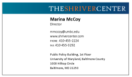
I am applying for an internship at my school designing misc. signage (for the most part). I am going in for an interview sometime this week, and they want to see a business card designed in their style. They sent me a a couple posters for examples of their style.
Poster 1

Poster 2

My Business Cards
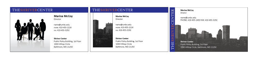
I am just looking for any suggestions for improvements. I am looking for things such as:
Does the style match the posters?
Is the imformation easily readable?
Please feel free to be picky, I can take criticism. Constructive Criticism.