Typophile

I would really appreciate some feedback on my first serif typeface

Andy Martin

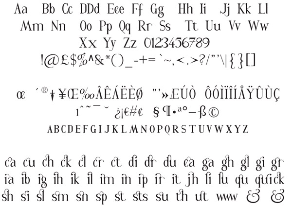
Hi Typophiles, this is my first attempt at a serif font and my first attempt to Opentype code, which seems to have been a success…so far.

I would love to hear your opinions, and have some feedback and to know if it has any value at all.

Thanks for taking the time to look.

Andy
This reminds me a bit of my old Rutager face, though yours is superior to that in every way.

If I were to pick a flaw, it's that there is a bit too much vertical symmetry, leading B, S, and to a lesser extent D and N, to look topheavy. Your regular ampersand is a bit light on the bottom too, but your alts are lovely, if somewhat large for anything but display use.

You have a serpentine question mark that actually works!
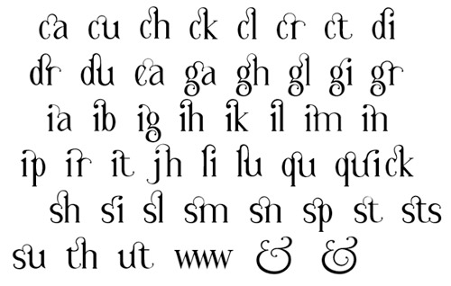
That's a fine bunch of ligatures you have there too. This is sure to be a hit amongst fans of things like that.

Cheers, I'm still going strong with the ligatures. I WILL MAKE 100 OF THE SUCKERS! Alot of them came about for personal use like names and initials etc. I was going to base the name on it…what it will be I have no idea.

I was never really a fan the original ampersand when I made it, but it was a very proud day when those two new ampersands turned out as they did.

I've never been a fan of the straight stemmed question mark, so this was my only alternative.

Thanks for the fast response.

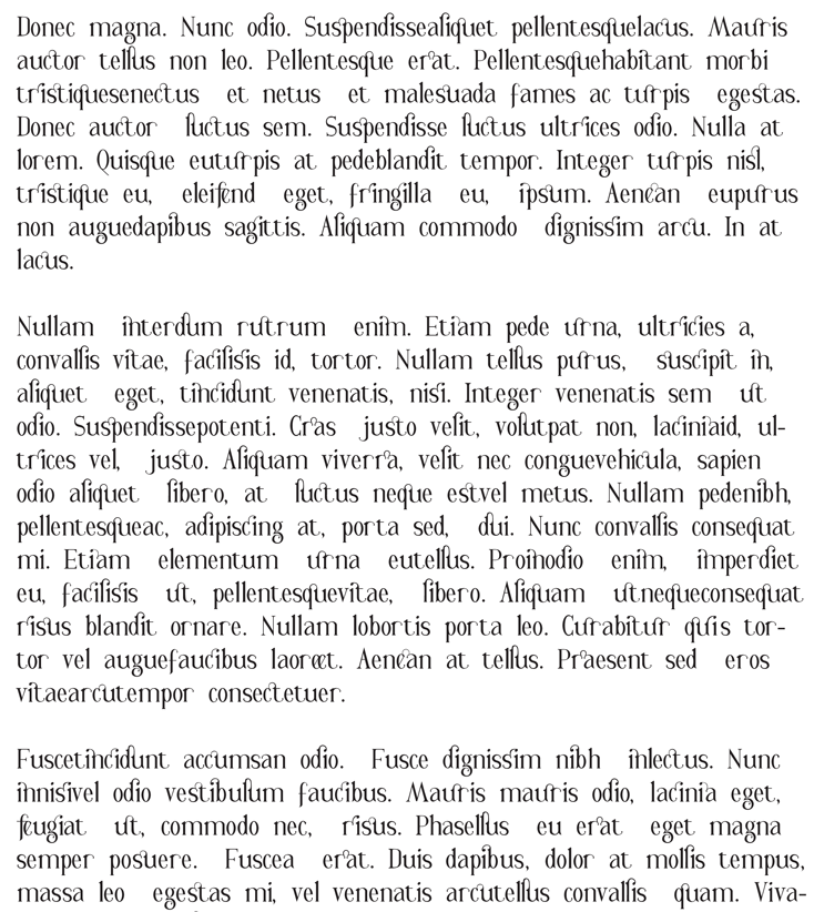
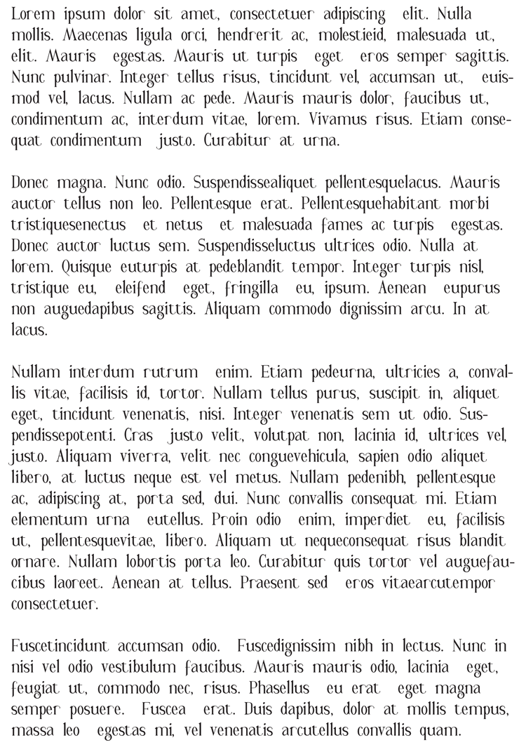
Here's an update with some dummy text. One with the ligatures and one without.

You asked for critique, you get it:
the OE-character looks wrong

And as an advice... don't push the ligatures. Design some (many!) for combinations, where they come naturally, but most of them don't make sense here, if you ask me.

(rather go for the way-to-seldom created gg, gy, ggy, etc.)

Szabolcs

You should post a pdf for better judgment.

First thing I would change is "space". It's too wide as are "t" and "r". Lc "o" and Uc "O" are too oval for my taste. Some caps (like "O", "Q", "S", "T", "L" and then some) look too light. Maybe "S" and "s" should have similar shapes.

Ligatures *are* fun, but target your energy at getting the base OK right now.

Hi Jos, I tried to post a pdf but it wouldn't let me, so I had t resolve to posting a a .gif. I'll look into it.

Thanks for the feedback Szabolcs and Jos, I appreciate that.

The ligatures were purely for fun.

You're very welcome Andy.

Click to edit your (first) post. There you can attach a (new) pdf.

Thanks Jos, I'll post a new pdf later this evening.

Take Care

Andy

I find that the widths seem inconsistent. The "u" and "n" for example seem to come from a different face than the "o" or "e". The overall nature is narrow, so I suggest narrowing the wider forms.

Captured from web.archive.org on 23 Jul 2014. view this capture