Hello folks,
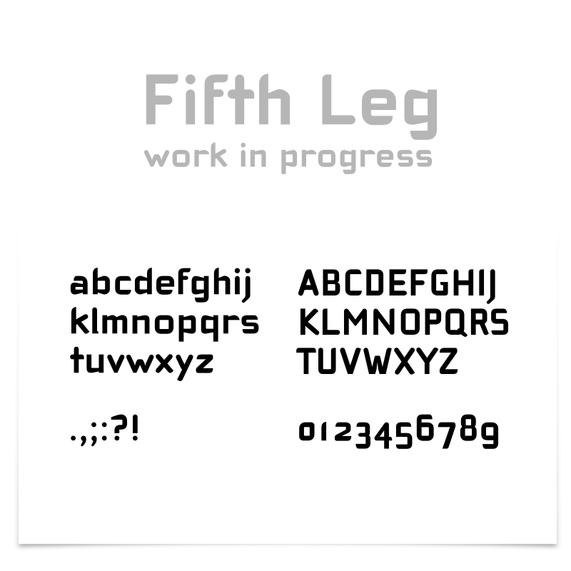
seeing all these amazing typefaces here I feel a little intimidated posting this, but I would love to hear some advice from more experienced designers. My goal is to create a strong headline for the openSUSE Linux distribution.
http://jimmac.musichall.cz/images/blog/5thleg-wip.pdf
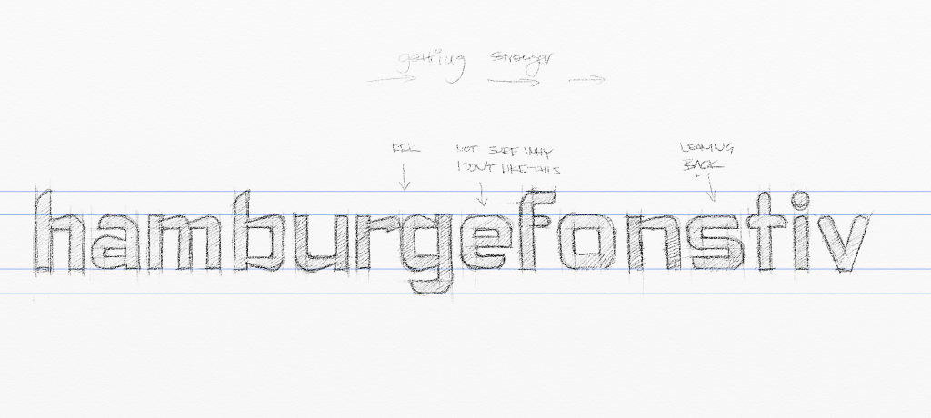
The obvious inspiration is Cholla by Sibylle Hagmann. I haven't gotten to the point of tackling spacing and kerning. Still only figuring out the glyphs. I'm struggling with c,e. Not really happy with Q, W and B. Thanks for all your critique and suggestions.
| Attachment | Size |
|---|---|
| 5thleg-wip4.png | 48.12 KB |
| sketch.png | 342.26 KB |