
Available immediately for download here at FontShop (FontStruct account required).
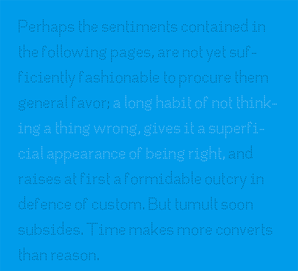
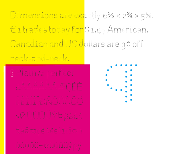
Lesson learned: Don't fight the format.
Available immediately for download here at FontShop (FontStruct account required).
Lesson learned: Don't fight the format.

¡Handpicked!

Ooh Lovely! Link? Or do we have to do the legwork? ;^P
[ Edit: I am blinder than a bat. Can we get the link color to pop a bit more? ;^P ]

Nice font by the way.
One word of caution to anyone using this font in print: Because of its very small relative size the dots are rendered by FontStruct as diagonal lumpy cardioids, instead of circles. Because the problems associated with relative size are a "known issue" we may be able to assume that the rendering will get better over time.


Very nice work David.
And... Advanced > View > Filters > Brick Size sliders rightward = instant bold!

David, thank you. I love it.
Sharon
Hey Craig, Thanks! I'm on it!
(edit)
And a few minutes later. Pullchain Bold rolls off the line.
You're welcome. I also recently realized you can drag a shape from the lower shape palette on top of the "used shapes" above and batch convert them. Make all your dots hexagons, etc. I played around with this with Pullchain a bit, but didn't find anything that worked better than your circles.
Thanks Mark Simonson for the 3D glasses.


Sweet!
Captured from web.archive.org on 12 Mar 2015. view this capture
